MA plot
The MA plot is a scatter plot rotated by
![]() . For two samples of expression values it plots for each gene the difference in expression against the mean expression level. MA plots are often used for quality control, in particular, to assess whether normalization and/or transformation is required.
. For two samples of expression values it plots for each gene the difference in expression against the mean expression level. MA plots are often used for quality control, in particular, to assess whether normalization and/or transformation is required.
You can create an MA plot comparing two samples by going to:
Tools | Microarray Analysis (![]() )| General Plots (
)| General Plots (![]() ) | Create MA Plot (
) | Create MA Plot (![]() )
)
In the first wizard step, select the case expression data ( (![]() ), (
), (![]() ) or (
) or (![]() ) ), and in the second wizard step, select the control data.
) ), and in the second wizard step, select the control data.
In the following wizard step (figure 35.56), specify the values types to be used for creating the MA plot (see Selecting transformed and normalized values for analysis).
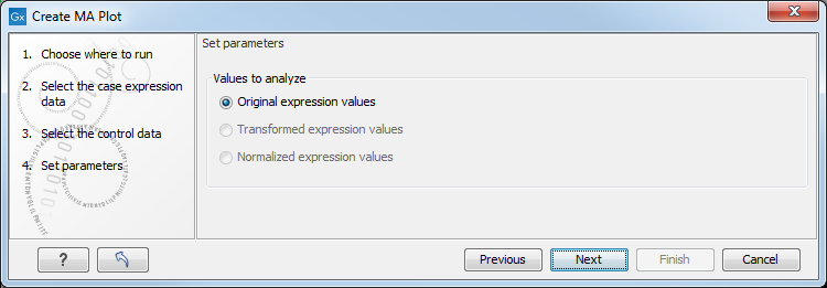
Figure 35.56: Selecting which values the MA plot should be based on.
Click on Finish to launch the analysis.
Viewing MA plots
The resulting plot is shown in figure 35.57.
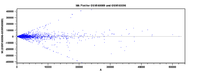
Figure 35.57: MA plot based on original expression values.
The X axis shows the mean expression level of a feature on the two samples and the Y axis shows the difference in expression levels for a feature on the two samples. From the plot shown in figure 35.57 it is clear that the variance increases with the mean. With an MA plot like this, you will often choose to transform the expression values.
Figure 35.58 shows the same two samples where the MA plot has been created using log2 transformed values.
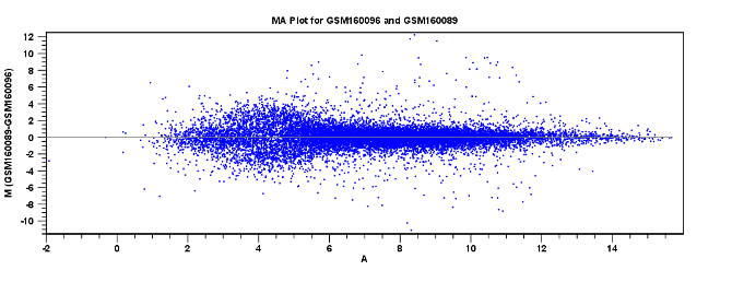
Figure 35.58: MA plot based on transformed expression values.
A more symmetric and even spread indicates that the dependence of the variance on the mean is not as strong as it was before transformation.
In the Side Panel to the left, there is a number of options to adjust the view. Under Graph preferences, you can adjust the general properties of the plot.
- Lock axes This will always show the axes even though the plot is zoomed to a detailed level.
- Frame Shows a frame around the graph.
- Show legends Shows the data legends.
- Tick type Determine whether tick lines should be shown outside or inside the frame.
- Tick lines at Choosing Major ticks will show a grid behind the graph.
- Horizontal axis range Sets the range of the horizontal axis (x axis). Enter a value in Min and Max, and press Enter. This will update the view. If you wait a few seconds without pressing Enter, the view will also be updated.
- Vertical axis range Sets the range of the vertical axis (y axis). Enter a value in Min and Max, and press Enter. This will update the view. If you wait a few seconds without pressing Enter, the view will also be updated.
- y = 0 axis. Draws a line where y = 0. Below there are some options to control the appearance of the line:
- Line width Thin, Medium or Wide
- Line type None, Line, Long dash or Short dash
- Line color Click the color box to select a color.
- Line width Thin, Medium or Wide
- Line type None, Line, Long dash or Short dash
- Line color Click the color box to select a color.
Below the general preferences, you find the Dot properties preferences, where you can adjust coloring and appearance of the dots:
- Dot type Can be None, Cross, Plus, Square, Diamond, Circle, Triangle, Reverse triangle, or Dot.
- Dot color Click the color box to select a color.
Note that if you wish to use the same settings next time you open a scatter plot, you need to save the Side Panel settings.