Histogram
A histogram shows a distribution of a set of values. Histograms are often used for examining and comparing distributions, e.g. of expression values of different samples, in the quality control step of an analysis.
You can create a histogram showing the distribution of expression value for a sample by going to:
Tools | Microarray Analysis (![]() )| General Plots (
)| General Plots (![]() ) | Create Histogram (
) | Create Histogram (![]() )
)
In the first wizard step, select a number of samples ( (![]() ), (
), (![]() ), (
), (![]() ) ) or a graph track. When you have selected more than one sample, a histogram will be created for each one.
) ) or a graph track. When you have selected more than one sample, a histogram will be created for each one.
In the following wizard step (figure 35.59), specify the values types to be used creating the histogram (see Selecting transformed and normalized values for analysis).
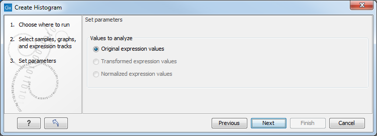
Figure 35.59: Selecting which values the histogram should be based on.
Click on Finish to launch the analysis.
Viewing histograms
The resulting histogram is shown in a figure 35.60
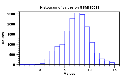
Figure 35.60: Histogram showing the distribution of transformed expression values.
The histogram shows the expression value on the x axis (in the case of figure 35.60 the transformed expression values) and the counts of these values on the y axis.
In the Side Panel to the left, there is a number of options to adjust the view. Under Graph preferences, you can adjust the general properties of the plot.
- Lock axes This will always show the axes even though the plot is zoomed to a detailed level.
- Frame Shows a frame around the graph.
- Show legends Shows the data legends.
- Tick type Determine whether tick lines should be shown outside or inside the frame.
- Tick lines at Choosing Major ticks will show a grid behind the graph.
- Horizontal axis range Sets the range of the horizontal axis (x axis). Enter a value in Min and Max, and press Enter. This will update the view. If you wait a few seconds without pressing Enter, the view will also be updated.
- Vertical axis range Sets the range of the vertical axis (y axis). Enter a value in Min and Max, and press Enter. This will update the view. If you wait a few seconds without pressing Enter, the view will also be updated.
- Break points. Determines where the bars in the histogram should be:
- Sturges method. This is the default. The number of bars is calculated from the range of values by Sturges formula [Sturges, 1926].
- Equi-distanced bars. This will show bars from Start to End and with a width of Sep.
- Number of bars. This will simply create a number of bars starting at the lowest value and ending at the highest value.
Below the graph preferences, you find Line color. Allows you to choose between many different colors. Click the color box to select a color.
Note that if you wish to use the same settings next time you open a principal component plot, you need to save the Side Panel settings.
Besides the histogram view itself, the histogram can also be shown in a table, summarizing key properties of the expression values. An example is shown in figure 35.61.
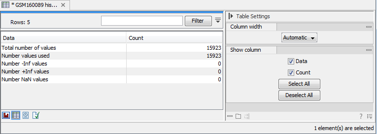
Figure 35.61: Table view of a histogram.
The table lists the following properties:
- Number +Inf values
- Number -Inf values
- Number NaN values
- Number values used
- Total number of values