Customizing the Workflow Editor
The Workflow Editor Side Panel (figure 15.23) contains search functionality and settings to aid workflow authors.
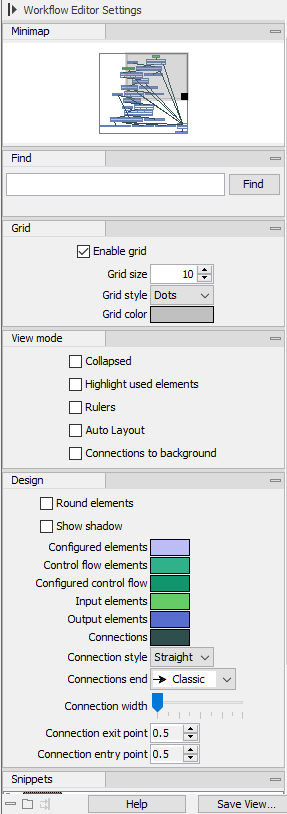
Figure 15.23: The Workflow Editor Side Panel, fully expanded.
Side Panel details:
- Minimap
- A zoomed-out overview of the workflow. The grey box indicates the workflow section visible in the editor. The editor and the minimap are linked. Updates in the editor, including the presentation of elements or groups and where the focus is, are reflected in the minimap, and dragging the grey box within the minimap moves the focus in the editor to the corresponding location.
- Find
- Search for elements or groups based on terms in their name.
After entering a search term and clicking on the Find button, the number of elements with that term in their name is reported below the search field and the first of these is selected in the editor. Click on the Find button again, or press the Enter key, to bring the next element found into focus.
- Display
- Settings affecting the general presentation of the workflow in the editor (figure 15.24 and 15.25):
- Show input and output channels When checked, the input and output channels on elements are displayed.
- Fade unconnected channels When checked, input and output channels not connected to other elements are faded.
- Send connections to back When checked, connections in the workflow are moved behind elements that they cross.
- Auto layout distance The distance between workflow elements applied when using auto layout. Decreasing the value decreases the distance between elements, and vice versa.
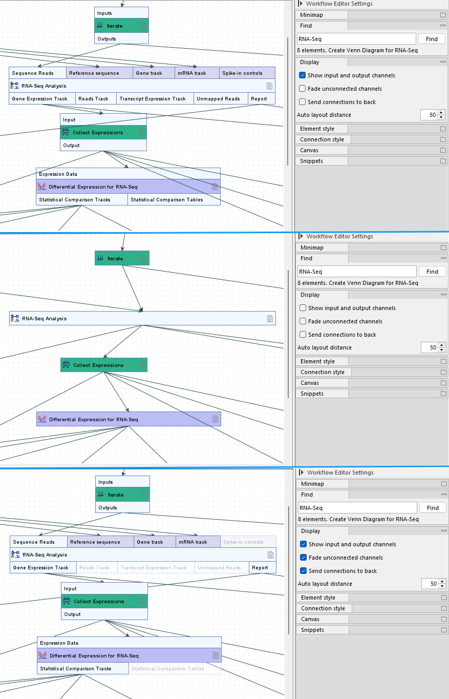
Figure 15.24: Input and output channels are visible by default (top). Input and output channels can be hidden (middle). Having all three display options checked can be helpful when reviewing how data will flow through the workflow (bottom).
Figure 15.25: The auto layout distance is 50 by default (left). After decreasing the value to 10 and applying auto layout once again, the elements are drawn much closer together. - Element style
- Settings affecting how elements are displayed.
By default, elements have square corners and no shadow. Corners can be rounded and shadows added using the Round elements and Show shadow options, respectively.
Elements and channels are colored according to their type, and element colors also depend on their configuration status. The remaining settings in this palette allow coloring to be customized.
- Connection style
- Settings affecting how connections are displayed.
Connection style settings including the color, line type, the symbol type to use as the end, the line width and where connections should be added along an input or output channel.
- Canvas
- Settings affecting the editor background.
The editor shows a dotted grid, without rulers, by default.
The grid can be hidden by unchecking the Show grid option. Checking the Show rulers option adds rulers along the left vertical and top horizontal edges of the canvas.
When the Show grid option is checked, the size, style, and color of the grid can be adjusted.
- Snippets
- Snippets are sections of workflows, which have been saved and can be easily added to a new workflow. Details are provided in Snippets in workflows.