The heat map view
In the heat map (figure 33.76), each column represents a sample, and each row represents a feature (gene or transcript). The normalized expression level for a sample and feature dictates the color of the corresponding cell and can be seen in the table view (![]() ). See Normalization and clustering for details on how expressions are normalized.
). See Normalization and clustering for details on how expressions are normalized.
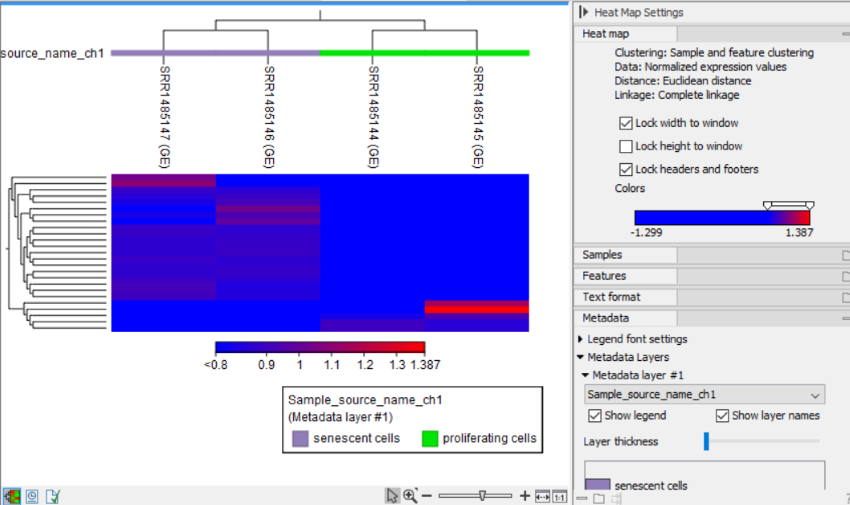
Figure 33.76: The feature level heat map.
The following can be configured in the Side Panel:
Heat map. General options for configuring layout and coloring.
- Lock width/height to window. When checked, the width/height of the heat map is locked to the window width/height when zooming in, ensuring that all columns/rows remain visible. Note that if both options are checked, zooming is not possible.
- Lock headers and footers. When checked, the shown names and trees will be visible when zooming in.
- Colors. The gradient depicts the expression levels, with low values on the left side and high values on the right side. See Side Panel for how to customize the gradient.
Samples. Options for configuring the display of the heat map columns.
- Show above/below. When checked, the names/colors legend/tree are shown above and/or below the heat map.
- Tree size. The size of the tree. Selecting Full tree adjusts the size automatically according to the tree depth.
- Order by. The order of the heat map columns. The following options are available:
- Tree. Uses the hierarchical tree structure to determine the order.
- Samples. Uses the order of the inputs to the tool.
- Active Metadata layers. Uses the order from the selected metadata layers.
- Metadata table column. Uses the chosen metadata table column to determine the order.
Features. Options for configuring the display of the heat map rows.
- Show left/right. When checked, the names/colors legend/tree are shown above and/or below the heat map.
- Tree size. The size of the tree. Selecting Full tree adjusts the size automatically according to the tree depth.
- Optimize tree layout. If checked, the rows are reordered, to the extent possible, such that the highest expression levels form a diagonal line from the top-left to the bottom-right of the heat map.
Metadata. Options for vizualizing metadata associated with the Expression tracks (![]() ).
).
- Legend font settings. Options for configuring the legend font.
- Metadata layer #1. Selecting a metadata table column adds a color bar above the heat map, indicating the corresponding values. The values in the metadata layer can be reordered using drag-and-drop. This impacts the order in the legend and/or columns, as relevant.
As many metadata layers can be added as needed. For each metadata layer, the following can be adjusted:
- Show legend. When checked, a legend is shown. The legend can be resized and it can be moved using drag-and-drop.
- Show layer names. When checked, the names of the metadata layers are shown to the left of the color bar.