Layout and Side Panel
Layout
The workflow layout can be adjusted automatically. Right clicking in the workflow editor will bring up a pop-up menu with the option "Layout". Click on "Layout" to adjust the layout of the selected elements (Figure 10.26). Only elements that have been connected will be adjusted.
Note! The layout can also be adjusted with the quick command Shift + Alt + L.
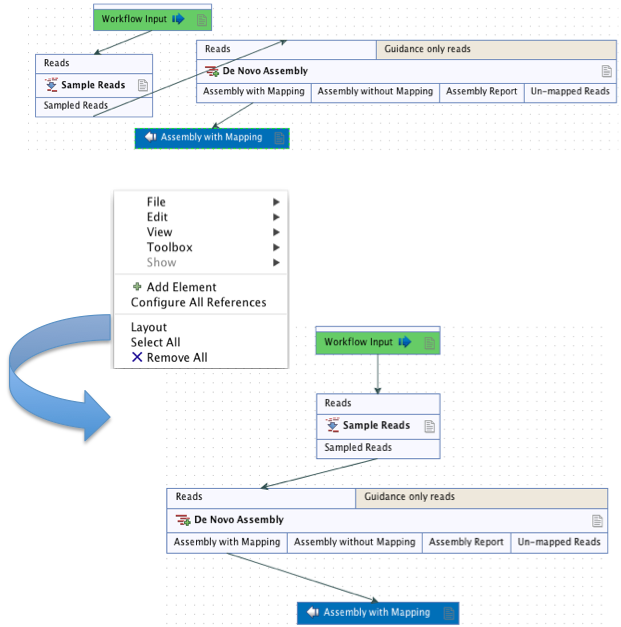
Figure 10.26: A workflow layout can be adjusted automatically with the "Layout" function.
It is very easy to make an image of the workflow. Simply select the elements in the workflow (this can be done pressing Ctrl + A, by dragging the mouse around the workflow while holding down the left mouse button, or by right clicking in the editor and then selecting "Select All"), then press the Copy button in the toolbar (![]() ) or CTRL + C. Press Ctrl + V to paste the image into the wanted destination e.g. an email or a text or presentation program.
) or CTRL + C. Press Ctrl + V to paste the image into the wanted destination e.g. an email or a text or presentation program.
Highlight Subsequent Path
This option causes the element that was clicked on, and all the elements downstream of that one, to be highlighted. Other elements will be grayed out (figure 10.27). The Remove Highlighting Subsequent Path option reverts the highlighting, returning to the normal workflow layout.
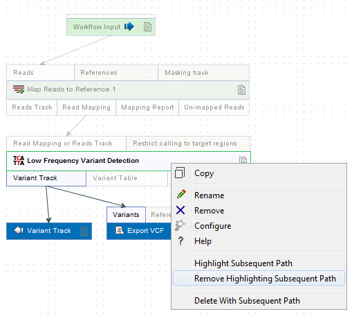
Figure 10.27: Highlight path from the selected tool and downstream.
Configuration Editor
Instead of configuring the various tools individually, the Configuration Editor enables the specification of all settings, references, masking parameters etc. through a single wizard window (figure 10.28). This editor is accessed through the (![]() ) icon located in the lower left corner.
) icon located in the lower left corner.
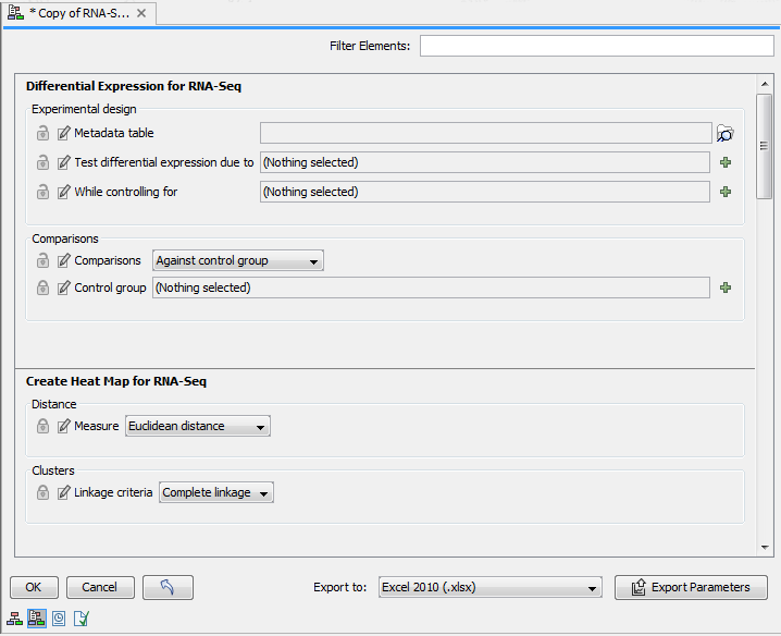
Figure 10.28: The Configuration Editor can be used configure all the tools that can be configured in a given Workflow.
Side Panel
In the workflow editor Side Panel, you will find the following workflow display settings that can be useful to know (figure 10.29):
- Grid
- Enable grid You can display a grid and control the spacing and color of the grid. Per default, the grid is shown, and the workflow elements snap to the grid when they are moved around.
- View mode
- Collapsed The elements of the workflow can be collapsed to allow a cleaner view and especially for large workflows this can be useful.
- Highlight used elements Ticking Highlight used elements (or using the shortcut Alt + Shift + U) will show all elements that are used in the workflow whereas unused elements are grayed out.
- Rulers Vertical and horizontal rules can be visualised
- Auto Layout Ticking Auto Layout will ensure rearrangement of elements once new elements are added.
- Connections to background Connecting arrows are shown behind elements. This may easy reading of element names and accessible parameters.
- Design
- Round elements Enable rounding of the element boxes.
- Show shadow Shadows of element boxes can be added.
- Configured elements Background color can be customized.
- Inpupt elements Background color can be customized.
- Edges Color of connecting arrows can be customized.
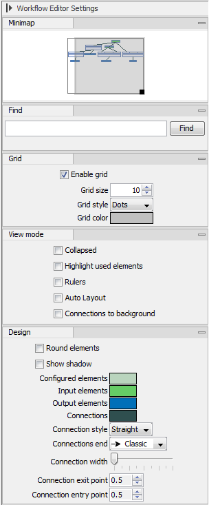
Figure 10.29: The Side Panel of the workflow editor.
