Principal component analysis plot
This will create a principal component plot as shown in figure 27.82.
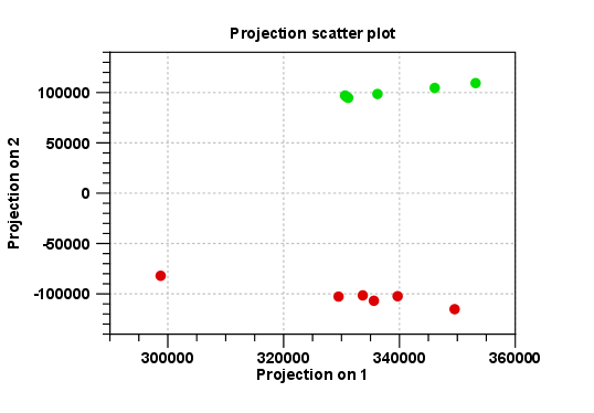
Figure 27.82: A principal component analysis colored by group.
The plot shows the projection of the samples onto the two-dimensional space spanned by the first and second principal component. (These are the orthogonal directions in which the data exhibits the largest and second-largest variability).
The plot in figure 27.82 is based on a two-group experiment. The group relationships are indicated by color. We expect the samples from within a group to exhibit less variability when compared, than samples from different groups. Thus samples should cluster according to groups and this is what we see. The PCA plot is thus helpful in identifying outlying samples and samples that have been wrongly assigned to a group.
In the Side Panel to the left, there is a number of options to adjust the view. Under Graph preferences, you can adjust the general properties of the plot.
- Lock axes. This will always show the axes even though the plot is zoomed to a detailed level.
- Frame. Shows a frame around the graph.
- Show legends. Shows the data legends.
- Tick type. Determine whether tick lines should be shown outside or inside the frame.
- Outside
- Inside
- Tick lines at. Choosing Major ticks will show a grid behind the graph.
- None
- Major ticks
- Horizontal axis range. Sets the range of the horizontal axis (x axis). Enter a value in Min and Max, and press Enter. This will update the view. If you wait a few seconds without pressing Enter, the view will also be updated.
- Vertical axis range. Sets the range of the vertical axis (y axis). Enter a value in Min and Max, and press Enter. This will update the view. If you wait a few seconds without pressing Enter, the view will also be updated.
- y = 0 axis. Draws a line where y = 0. Below there are some options to control the appearance of the line:
- Line width
- Thin
- Medium
- Wide
- Line type
- None
- Line
- Long dash
- Short dash
- Line color. Allows you to choose between many different colors. Click the color box to select a color.
- Line width
Below the general preferences, you find the Dot properties:
- Select sample or group. When you wish to adjust the properties below, first select an item in this drop-down menu. That will apply the changes below to this item. If your plot is based on an experiment, the drop-down menu includes both group names and sample names, as well as an entry for selecting "All". If your plot is based on single elements, only sample names will be visible. Note that there are sometimes "mixed states" when you select a group where two of the samples e.g. have different colors. Selecting a new color in this case will erase the differences.
- Dot type
- None
- Cross
- Plus
- Square
- Diamond
- Circle
- Triangle
- Reverse triangle
- Dot
- Dot color. Allows you to choose between many different colors. Click the color box to select a color.
- Show name. This will show a label with the name of the sample next to the dot. Note that the labels quickly get crowded, so that is why the names are not put on per default.
Note that if you wish to use the same settings next time you open a principal component plot, you need to save the settings of the Side Panel.