Creating box plots - analyzing distributions
In most cases you expect the majority of genes to behave similarly under the conditions considered, and only a smaller proportion to behave differently. Thus, at an overall level you would expect the distributions of the sets of expression values in samples in a study to be similar. A boxplot provides a visual presentation of the distributions of expression values in samples. For each sample the distribution of it's values is presented by a line representing a center, a box representing the middle part, and whiskers representing the tails of the distribution. Differences in the overall distributions of the samples in a study may indicate that normalization is required before the samples are comparable. An atypical distribution for a single sample (or a few samples), relative to the remaining samples in a study, could be due to imperfections in the preparation and processing of the sample, and may lead you to reconsider using the sample(s).
To create a box plot:
Toolbox | Transcriptomics Analysis (![]() )| Quality Control | Create Box Plot (
)| Quality Control | Create Box Plot (![]() )
)
Select a number of samples ( (![]() ) or (
) or (![]() )) or an experiment (
)) or an experiment (![]() ) and click Next.
) and click Next.
This will display a dialog as shown in figure 27.69.
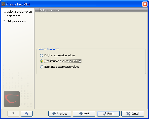
Figure 27.69: Choosing values to analyze for the box plot.
Here you select which values to use in the box plot (see Selecting transformed and normalized values for analysis).
Click Next if you wish to adjust how to handle the results. If not, click Finish.
Subsections