Classify Whole Metagenome Data abundance table
The abundance table contains the taxa identified in your sample.
To create a multi-sample abundance table, use the Merge Abundance Tables tool (Merge Abundance Tables). Some of the options mentioned in the following are only relevant for multi-sample abundance tables.
The abundance table can be visualized in Table view (![]() ), Stacked Visualization view (
), Stacked Visualization view (![]() ), and Sunburst view (
), and Sunburst view (![]() ).
).
Table view (![]() )
)
The table displays a number of columns, some of which are available only when the table is not aggregated by taxonomy (figure 6.15):
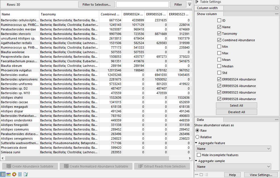
Figure 6.15: The table view of the abundance table lists name, taxonomy, abundance etc. of the identified taxa. The example shows a multi-sample table.
- ID. The ID of the taxon.
- Taxonomy: The taxonomy of the taxon as specified by the reference database.
- Combined Abundance: Total abundance across samples.
- Min, Max, Mean, Median and Std. Minimum, maximum, mean, median and standard deviation of abundance values across samples.
- Abundance. Number of reads assigned to the taxa.
The Side panel contains the following settings of relevance to the Classify Whole Metagenome Data abundance table:
- Show abundance values as. Switch between Raw and Relative abundance. Relative abundance is calculated as: Relative abundance = (Abundance) / (Sum of abundances).
- Aggregate feature. Select a taxonomic level to aggregate abundance values by. For example, select Family to display abundance values per Family as opposed to per genome.
- Aggregate sample. Select a metadata attribute to aggregate samples with same metadata value into one column with combined abundance values.
Below the table, the following actions are available:
- Create Abundance Subtable. Creates a table containing only the selected rows.
- Extract Reads from Selection. Extracts reads that were uniquely associated with the selected rows. This option is available if you selected the output Reference database matches in the Classify Whole Metagenome Data tool dialog.
Stacked Visualization view (![]() )
)
The Stacked Visualization view displays the relative abundance of each taxon.
Use the Side panel setting Bar type to switch between Bar Chart (figure 6.16) and Area Chart (figure 6.17). The charts can be scaled by percentage, where all bars have the same height of 100%, or counts, where the bar heights are proportional to the number of counts. Different colored bars or areas represent different taxa. A column represents a sample or - if aggregated by sample level - a group of samples.
Hold your pointer over an area to have the full taxonomy and abundance value displayed in a tooltip.
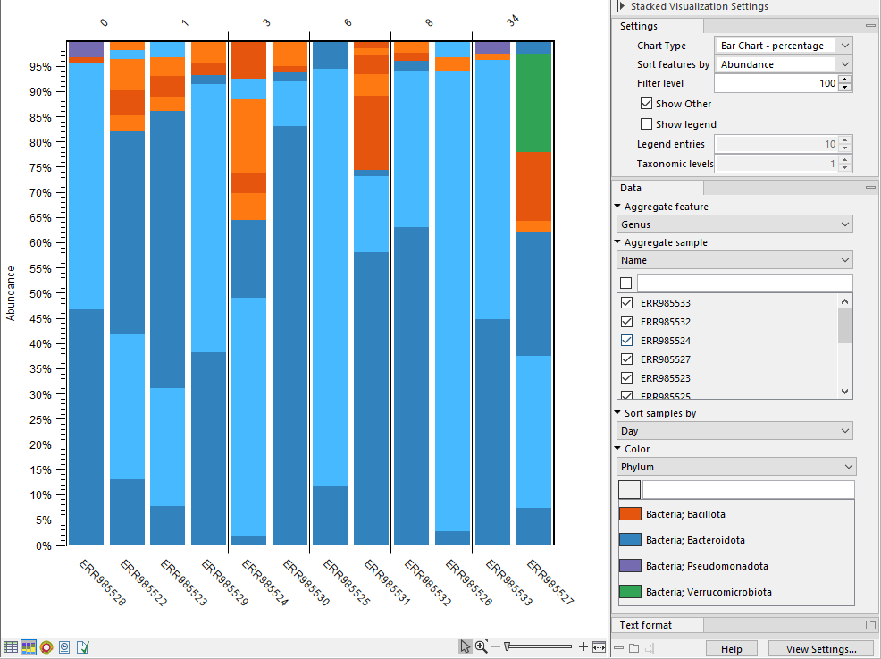
Figure 6.16: Stacked bar chart.
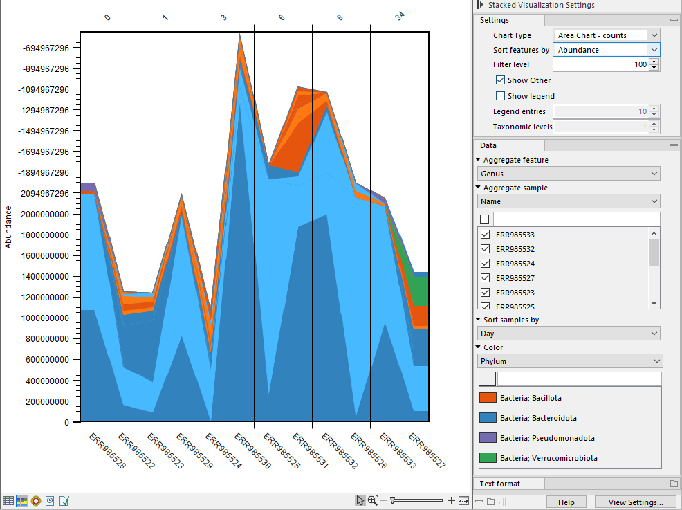
Figure 6.17: Stacked area chart.
You can adjusted the view further via the Side panel settings. Options include:
- Aggregate feature. Select a taxonomic level to aggregate abundance values by. For example, select Family to have each section in the plot represent a Family instead of a genome.
- Aggregate sample. Select a metadata attribute to aggregate samples with same metadata value into one column with combined abundance values. (Relvant for multi-sample abundance tables only). Use the checkboxes below to specify which samples or groups of samples to include in the plot.
- Sort samples by. Select a metadata attribute to sort samples by the corresponding attribute values. The values are listed above the plot (figure 6.16).
- Color. Select a taxonomic level to color the plot by. As an example, if you select Phylum, all taxa belonging to the same Phylum will get different shades of the same base color.
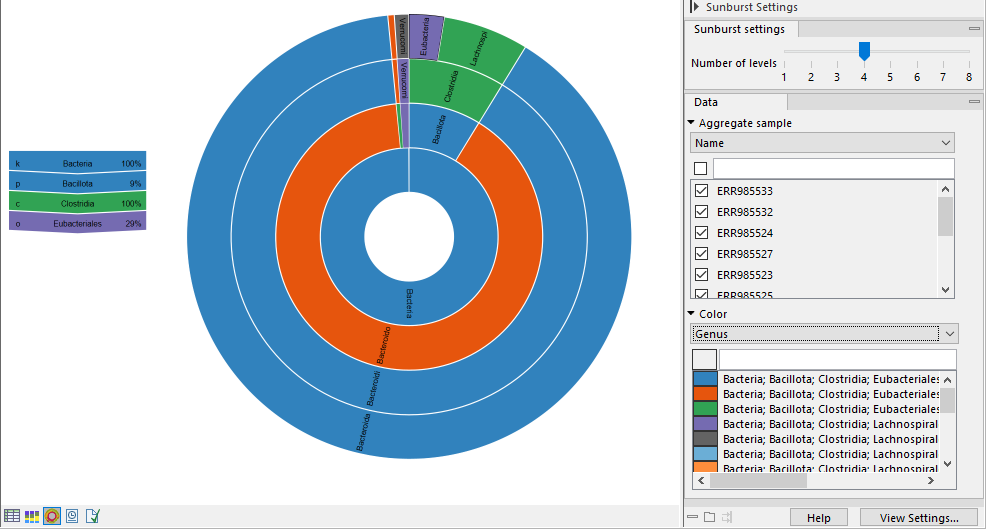
Sunburst view (![]() )
)
The plot is zoomable. Click on a section to zoom in and render the plot with this section at the center. Click on the center of the plot to zoom out one level at a time.
Hold your pointer over the plot to have the legend reflect the highlighted section (figure 6.18).
Use the Side panel settings to adjust the plot:
- Number of levels. Select the maximum number of taxonomic levels to display.
- Aggregate sample. Select a metadata attribute to group aggregate samples by, and use the checkboxes below to specify which samples or groups of samples to include in the plot.
- Color. Select a taxonomic level to color the plot by. Lower levels will inherent the color and get different shades of the same color.