Creating graph tracks
Graphs can be a good way to quickly get an overview of certain types of information. This is the case for e.g. the GC content in a sequence or the read coverage. The CLC Cancer Research Workbench offers two different tools that can create graph tracks from either a sequence or a read mapping. The two available tools are:
- Create GC Content Graph
- Create Mapping Graph
Both tools are found in the toolbox:
Toolbox | Genome Browser (![]() ) | Graphs
) | Graphs
Graph tracks can also be created directly from the track view or track list view by right-clicking the track you wish to use as input, which will give access to the toolbox.
To understand what graph tracks are, we will look at an example. We will use the Create GC Content Graph tool to go into detail with one type of graph tracks.
Create GC Content Graph
The Create GC Content Graph tool needs a sequence track as input and will create a graph track with the GC contents of that sequence.
To run the tool go to the toolbox:
Toolbox | Genome Browser (![]() ) | Graphs | Create GC Content Graph
) | Graphs | Create GC Content Graph
Select the sequence track that should be used as input (see figure 18.24).
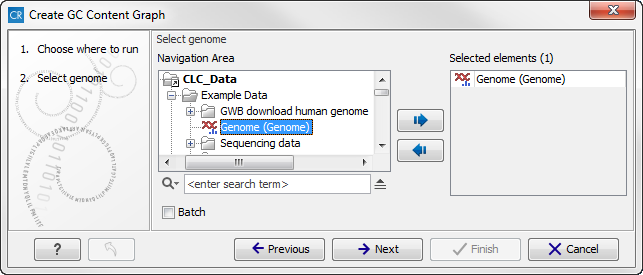
Figure 18.24: Select the sequence track that should be used as input.
Click on the button labeled Next to go to the next wizard step (see figure 18.25). In this wizard step you can specify the window size, which is the size of the window around the central base in the region that is used to calculate the GC content. This number must be odd as you need a central base and an equal number of bases to each side of the central base. E.g. with a window size of 25, the GC content for the central base will be calculated based on the nucleotide composition in the central base and the 12 bases upstream and 12 bases downstream of the central base.
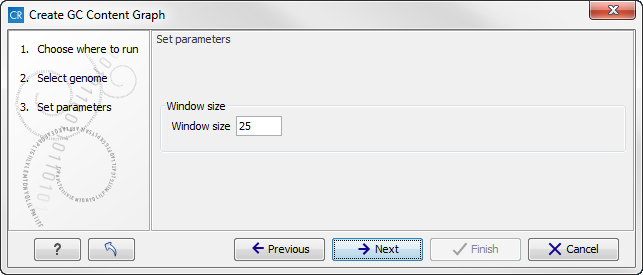
Figure 18.25: Specify the window size. The window size is the region around each individual base that should be used to calculate the GC content in a given region.
Click on the button labeled Next, choose to save your results, and click on the button labeled Finish. The output can be seen in figure 18.26. The output from "Create GC Content Graph" is a graph track. The graph track shows one value for each base with one graph being available for each chromosome. When zoomed out as shown in this figure, three different graphs with three different colors can be seen. The top graph with the darkest blue color represents the maximum observed GC content values in the specific region, the graph in the middle with the intermediate blue color shows the mean observed GC content values in the specific region, and the graph at the bottom with the light blue color shows the minimum observed GC content values in the specific region.
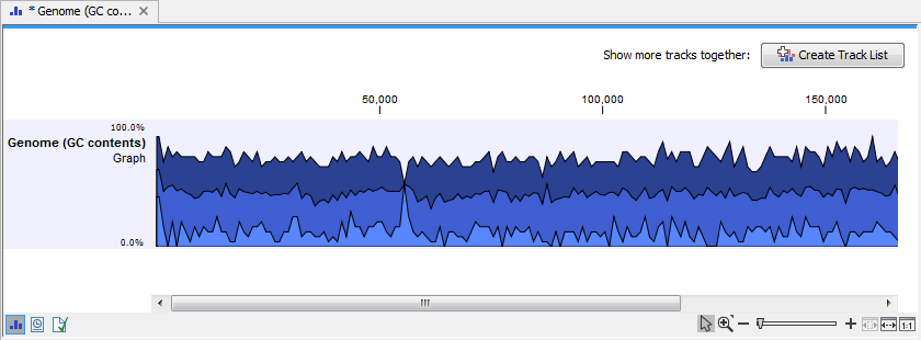
Figure 18.26: The output from "Create GC Content Graph" is a graph track. The graph track shows one value for each base with one graph being available for each chromosome.
When zooming all the way in to single nucleotide level only one graph can now be seen as you ar now no longer looking at large genomic regions. In stead, you can now use the tooltip by mousing over each individual base to look at the GC content for that particular base and the number of bases that you specified as the window size to be used. This is shown in figure 18.27 where the top part of the figure shows the graph track when zoomed all the way out and the bottom part of the figure shows a genome browser view with the sequence track that was used as input together with the output graph track. The input and the output tracks were combined in one view as a genome browser view by clicking on the button labeled Create Genome Browser View found in the upper right corner of the graph track in the top part of the figure (see the red arrow).
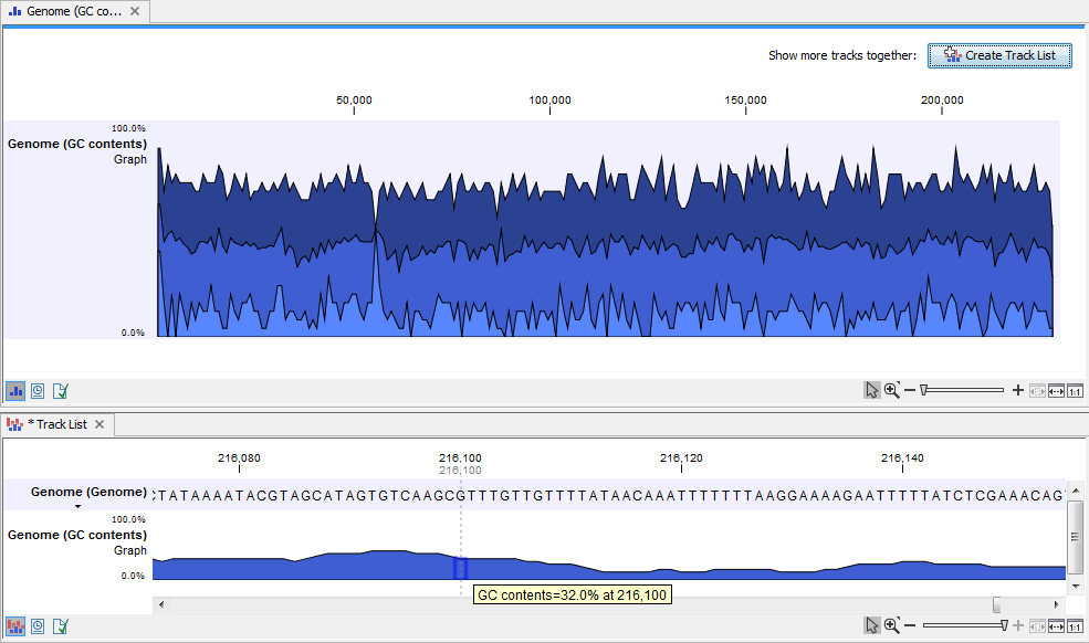
Figure 18.27: The top part of the figure shows the graph track when zoomed all the way out. The bottom part of the window shows a graph track together with the input genomic sequence at single nucleotide resolution. By mousing over one nucleotide, you can see the GC content for this position. In our example we chose a window size of 25 nucleotides and the GC content that is shown for one nucleotide is the GC content for the central nucleotide and the 12 bases upstream and downstream of this nucleotide.
This track can then be displayed together with the sequence and other tracks in a genome browser view.
Create Mapping Graph
The Create Mapping Graph tool can create a range of different graphs from a read mapping track. To run the tool go to the toolbox:
Toolbox | Genome Browser (![]() ) | Graphs | Create Mapping Graph
) | Graphs | Create Mapping Graph
Select the read mapping as shown in figure 18.28 and click on the button labeled Next.
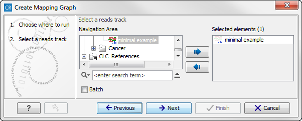
Figure 18.28: Creating graph track from mappings.
Select the graph tracks that you would like to create. The following options exist:
- Read coverage. For each position this graph shows the number of reads contributing to the alignment (see a more elaborate definition in Reference sequence statistics).
- Non-specific read coverage. Non-specific reads are reads that would fit equally well other places in the reference genome.
- Unaligned ends coverage. Un-aligned ends arise when a read has been locally aligned to a reference sequence, and then end of the read is left unaligned because there are mismatches or gaps relative to the reference sequence. This part of the read does not contribute to the read coverage above. The unaligned ends coverage graph shows how many reads that have unaligned ends at each position.
- Non-perfect read coverage. Non-perfect reads are reads with one or more mismatches or gaps relative to the reference sequence.
- Paired read coverage. This lists the coverage of intact pairs. If there are no single reads and no pairs are broken, it will be the same as the standard read coverage above.
- Broken pair coverage. A pair is broken either because only one read in the pair matches, or because the distance or relative orientation between the reads is wrong.
- Paired end distance. Displays the average distance between the forward and the reverse read in a pair. A pair contributes to this graph from the beginning of the first read to the end of the second read.
One graph track output will be created for each of the graph tracks you have chosen by checking the boxes shown in figure 18.29.
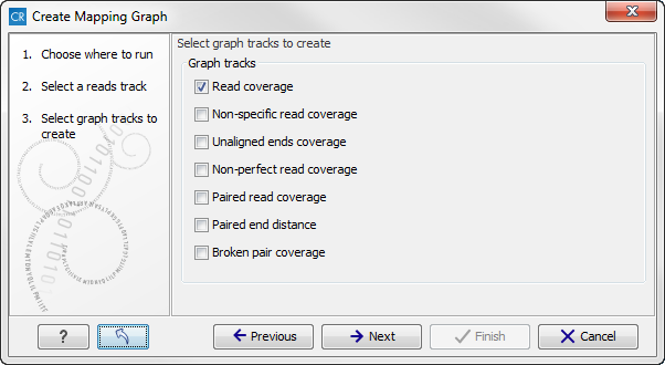
Figure 18.29: Choose the types of graph tracks you would like to generate.
Click on the button labeled Next, choose where to save the generated output(s) and click on the button labeled Finish.
An example of three different outputs is shown in figure 18.30. Two of the views have been dragged and dropped to other areas of the View Area to be able to see them in the same window. If you would like to learn more about how to do this, please refer to Arrange views in View Area.
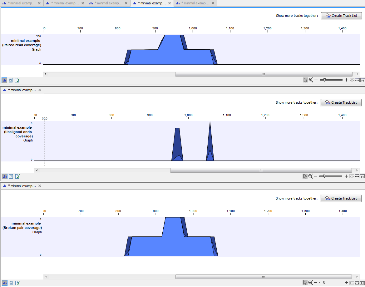
Figure 18.30: Three types of graph tracks are shown.
In this example we generated all possible outputs and chose to open them without saving. You can see that the names of the tabs are marked with an asterisk, which indicates that the graph shown in the view area has not been saved or that changes have been made that must be saved if you want to keep them. Three of the generated outputs have been opened. If you would like to see the outputs in the same view, you can do this by creating a genome browser view. Click on the button labeled Create genome Browser View in the upper right corner of each of the graph tracks shown in the View Area. Combining graph tracks in a genome browser view links the individual tracks together, which makes it much easier to compare the different graph tracks.
Another thing that is worth noting is the options found in the Side Panel. In particular the option "Fix graph bounds" found under Track layout is useful to know if you would like to manually adjust the numbers on the y-axis.
Identify Graph Threshold Areas
The Identify Graph Threshold Areas tool uses graph tracks as input to identify graph regions that fall within certain limits (thresholds). Both a lower and an upper threshold can be specified to create an annotation track for those regions of a graph track where the values are in the given range (see figure 18.31). Consequently, in order to identify only those parts of the track that exceed a certain minimum, one would choose the minimum threshold and set the upper limit to a value well above the maximum occurring in the track (and vice versa for finding ranges that are below a maximum threshold). Obviously, the range chosen for the lower and upper thresholds will depend on the data (coverage, quality etc.).
The "window-size" parameter specifies the width of the window around every position that is used to calculate an average value for that position and hence "smoothes" the graph track beforehand. A window size of 1 will simply use the value present at every individual position and determine if it is within the upper and lower threshold, hence resulting in the same "non-smoothing" behavior as previous versions of the workbench without this parameter. In contrast, a window size of 100 checks if the average value derived from the surrounding 100 positions falls between the minimum and maximum threshold. Such larger windows help to prevent "jumps" in the graph track from fragmenting the output intervals or help to detect over-represented regions in the track that are only visible when looked at in the context of larger intervals and lower resolution. An example output is shown in figure 18.32 where the coverage graph has a couple of local minima near zero. However, by using the averaging window, the tool is able to produce a single unbroken annotation covering the entire region. Of course larger window sizes result in regions that are broader and hence their boundaries are less likely to exactly coincide with the borders of visually recognizable borders of regions in the track.
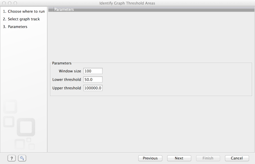
Figure 18.31: Specification of lower and upper thresholds.
When zoomed out, the graph tracks are composed of three curves showing the maximum, mean, and minimum value observed in a given region (see figure 18.32). When zoomed in all the way down to base resolution only one curve will be shown reflecting the exact observation at each individual position.
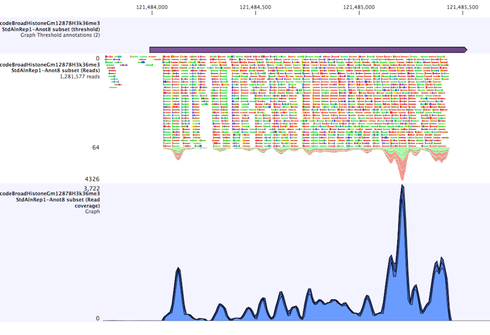
Figure 18.32: Track list including a region identified by the parameters set above on a dataset of H3K36 methylation from ENCODE. The top track shows the resulting region. Below is the track containing the reads. The graph track at the bottom shows the coverage with the minimum, mean, and maximum observed values.