Interpreting box plots
This section will show how to interpret a box plot through a few examples.
First, if you look at figure 31.29, you can see a box plot for an experiment with 5 groups and 27 samples.
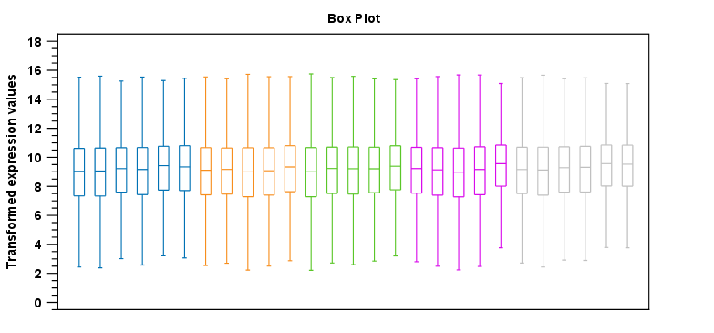
Figure 31.29: Box plot for an experiment with 5 groups and 27 samples.
None of the samples stand out as having distributions that are atypical: the boxes and whiskers ranges are about equally sized. The locations of the distributions however, differ some, and indicate that normalization may be required. Figure 31.30 shows a box plot for the same experiment after quantile normalization: the distributions have been brought into par.
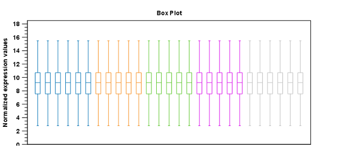
Figure 31.30: Box plot after quantile normalization.
In figure 31.31 a box plot for a two group experiment with 5 samples in each group is shown.
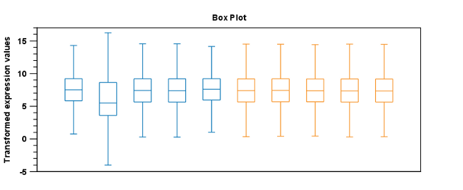
Figure 31.31: Box plot for a two-group experiment with 5 samples.
The distribution of values in the second sample from the left is quite different from those of other samples, and could indicate that the sample should not be used.