Combine Reports output
The Combine Reports tool generates a single report containing summaries and other selected information from the reports provided as input.
The report is divided into sections, typically one section per input report type.
By default, summary information is displayed in table format. Each table presents a summary of the corresponding information from the input reports. Each row of a table contains information from one of the input reports.
The first column of each table contains the sample name, taken from the corresponding input report.
If the Reports originate from a single sample option was enabled when creating the report, then there will generally be one row per table, and the sample name will be determined from all the input reports considered.
Where the Reports originate from a single sample was not enabled, tables will contain additional rows, shaded in pale gray, which report the minimum, median, maximum, mean and standard deviation for all numeric columns (figure 26.26).
If the Show summary information as plots option was enabled, tables will be displayed as box plots, wherever possible. Each numeric column will be presented as one box in the plot (figure 26.26).
Combined reports contain only data from report types supported by the Combined Reports tool. Where some of the reports supplied as inputs are supported and some are not, the combined report will contain information only from the supported ones. Supported report types are listed in Report types supported. If none of the reports provided are of supported types, the report will contain a statement saying this.
Outliers and other highlighted entries in combined reports
Table cells are colored if the data they contain is considered an outlier or problematic.
Cells containing outliers are highlighted in yellow. Outliers are those outside the range: lower quartile - 1.5 IQR, upper quartile + 1.5 IQR.
If the Include tables for outliers option was enabled, any table or plot containing outliers will be followed by an additional table containing the names of the outliers. A row is provided for each column containing outliers (figure 26.26).
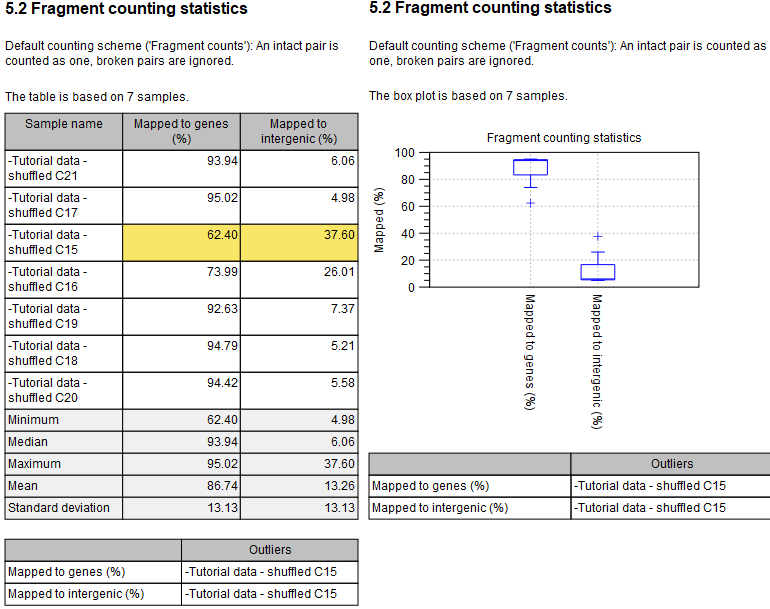
Figure 26.26: By default, summary information is reported in table format (left). Tables of numerical data in cross-sample reports contain summary rows, shaded in pale gray. Cells containing values identifed as outliers are highlighted in yellow. Box plots are generated instead of tables for numerical data if the "Show summary information as plots" option was enabled (right). The tables at the bottom, containing summary information about outliers, are present because the reports were generated with the "Include tables for outliers" option enabled.
Cells highlighted in pink indicate that a problem has been identified. This is explained underneath the table for each column that contains pink cells. If a cell is both an outlier and problematic, it will be highlighted in red (figure 26.27).
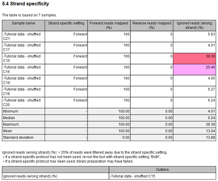
Figure 26.27: Table with both problematic cells and outliers. The table is followed by an explanation for the column "Ignored reads (wrong strand) (%)" containing problematic cells.