The heat map view
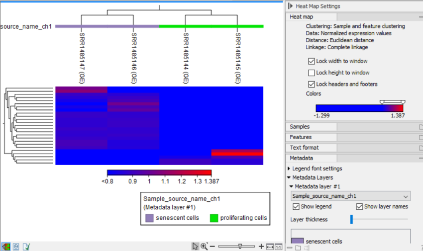
Figure 26.30: The 2D heat map.
After the tool completes, a heat map like the one shown in (figure 26.30) is produced. In the heat map each row corresponds to a feature and each column to a sample. The color in the ![]() 'th row and
'th row and ![]() 'th column reflects the expression level of feature
'th column reflects the expression level of feature ![]() in sample
in sample ![]() (the color scale can be set in the side panel). The expression values used are normalized log CPM values, see TMM Normalization.
(the color scale can be set in the side panel). The expression values used are normalized log CPM values, see TMM Normalization.
There are a number of options to change the appearance of the heat map. At the top of the Side Panel, you find the Heat map group (see figure 26.30).
- Lock width to window When you zoom in the heat map, you will per default only zoom in on the vertical level. This is because the width of the heat map is locked to the window. If you uncheck this option, you will zoom both vertically and horizontally. Since you normally have more features than samples, it is useful to lock the width since you then have all the samples in view all the time.
- Lock height to window This is the corresponding option for the height. Note that if you check both options, you will not be able to zoom at all, since both the width and the height are fixed.
- Lock headers and footers This will ensure that you are always able to see the sample and feature names and the trees when you zoom in.
- Colors The expression levels are visualized using a gradient color scheme, where the right side color is used for high expression levels and the left side color is used for low expression levels. You can change the coloring by clicking the box, and you can change the relative coloring of the values by dragging the two knobs on the white slider above.
Below you find the Samples and Features groups. They contain options to show names, color legends, and trees above or below the heat map. The tree options also control the Tree size, including the option of showing the full tree, no matter how much space it will use.
The Metadata group makes it possible to visualize metadata associated with the Expression tracks:
- Legend font settings adjusts the label settings.
- Metadata layers Adds a color bar to the hierarchical sample tree, colored according to the value of a chosen metadata table column.