The report output from Single Cell ATAC-Seq Analysis
The report contains the following sections:
Reads
For each sample, the following information is shown:
- Input read pairs. The number of paired reads in the read mapping. This includes pairs that are mapped ambiguously, but excludes pairs on chromosomes supplied to the Chromosomes to ignore option.
- Unique read pairs. The number of paired reads after removing reads that map ambiguously.
- % Unique. "Unique read pairs" / "Input read pairs" x 100. If the sample was PCR amplified, then a low "% Unique" indicates that most fragments in the sample were sequenced.
Comparing these values across samples may reveal biases. For example, if control samples have more reads than case samples, then one might expect to see a higher proportion of cells for each peak for the control samples.
Fragments
A single fragment size distribution plot is shown for all the data. This plot has a characteristic shape for scATAC-Seq data, as seen in figure 12.1. The absence of this shape may indicate failed library preparation.
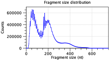
Figure 12.1: A characteristic ATAC-seq fragment size distribution. The fragment size distribution should have few fragments <30 nt as this is too small for the Tn5 transposase to bind. Short fragments are usually most abundant. A peak should be seen at about 180 nt. Subsequent peaks may be present with nucleosome spacing i.e. a new peak approximately 147 nt after each previous peak. A high frequency periodicity may be observed for small fragment sizes. This is related to the DNA helix pitch. Data is for two samples from [Taavitsainen et al., 2021].
Two additional metrics are shown per sample:
- Fragments in peaks. The total number of read pairs counted per peak and barcode. This is calculated on all barcodes before any filtering by the Minimum peak count option. For details of which read pairs are counted, see The Single Cell ATAC-Seq Analysis algorithm.
- % In peaks. "Fragments in peaks" / "Unique read pairs" x 100. If this is low, check the Read Mapping output to see whether reads map to a specific chromosome that should be ignored, are distributed evenly across the genome (which may indicate failed library preparation), or are piled up at particular regions of high coverage. The latter is expected to some degree, but is not expected to affect downstream analysis. Lists of known high coverage regions are available from the ENCODE project for human and mouse [Amemiya et al., 2019].
Tn5 bias correction
The Tn5 enzyme has a bias towards certain sequences. This should be seen in the "before" lines of the nucleotide frequency plots (figure 12.2). An absence of a detectable bias indicates problems with library preparation. A different bias may reflect use of a different enzyme.
The "after" lines should show markedly less bias. Bias correction is used to improve the assignment of transcription factors to peaks via footprinting. Failure to correct for bias may lead to more transcription factors being associated with each peak.
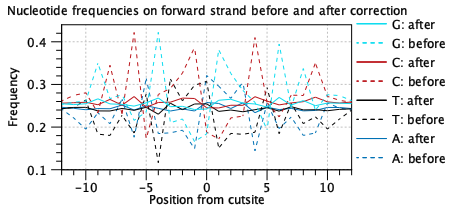
Figure 12.2: A characteristic Tn5 insertion bias is seen in the "before" lines. This is reduced after bias correction as part of footprinting. Data is for two samples from [Taavitsainen et al., 2021].
Cells
A barcode rank plot is shown for all the samples. An example is shown in figure 12.3. The red horizontal line shows the cutoff specified by the Minimum peak count option. All barcodes above the red line are retained as cells, and all barcodes below the line are discarded. The lines for each sample should be nearly vertical at the point where they cross the threshold line, indicating an abrupt fall in the number of peaks at the threshold. If this is not the case, consider re-running the tool with a different Minimum peak count.
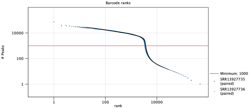
Figure 12.3: A barcode rank plot is a log-log plot of the total number of peaks for each barcode vs the rank of the barcode, in decreasing order of the number of peaks. Barcodes above the red threshold line are retained as cells. Data is for two samples from [Taavitsainen et al., 2021].
Two additional metrics are shown per sample:
- Barcodes before filtering. The total number of barcodes for each sample.
- Cells after filtering. The number of cells after filtering. This is the x value at which the red threshold line meets the sample line on the plot.
Peaks
A summary table is shown for all peaks:
- Peaks. The total number of peaks seen in the sample.
- Peaks with nearby gene. The number of these peaks that were annotated with a nearby gene.
- % with nearby gene. "Peaks with nearby gene" / "Peaks" x 100.
- Peaks with transcription factor. The number of peaks that were annotated with a transcription factor.
- % with transcription factor. "Peaks with transcription factor" / "Peaks" x 100.
Details are provided for peaks with nearby genes:
- Peaks with nearby gene. The number of peaks that were annotated with a nearby gene. This is the same number as in the summary table.
- Peaks at TSS. The number of peaks whose center was within -1000nt to +100nt of a gene's transcription start site (TSS).
- % at TSS. "Peaks at TSS" / "Peaks with nearby gene" x 100.