The Heat Map output of Create Expression Plot
In a Heat Map each row corresponds to a gene and each column to a cell. The color in the i'th row and j'th column reflects the z-score normalized expression of feature i in cell j. This allows the relative expression of genes with very different average expressions to be visualized in the same plot, but means that expression values cannot be compared between genes - only between cells for the same gene. The normalized expression can be seen in the table view (There are a number of options to change the appearance of the Heat Map. At the top of the Side Panel, you find the Heat Map group (see figure 9.2).
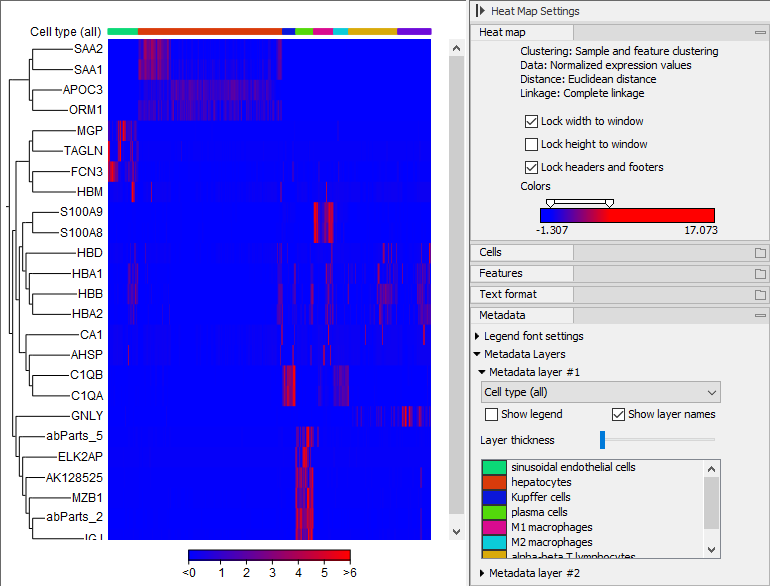
Figure 9.2: A heat map visualization of data from [MacParland et al., 2018].
- Lock width to window When you zoom in the Heat Map, you will per default only zoom in on the vertical level. This is because the width of the Heat Map is locked to the window. If you uncheck this option, you will zoom both vertically and horizontally.
- Lock height to window This is the corresponding option for the height. Note that if you check both options, you will not be able to zoom at all, since both the width and the height are fixed.
- Lock headers and footers This will ensure that you are always able to see the cell and feature names and the trees when you zoom in.
- Colors The expression levels are visualized using a gradient color scheme, where the right side color is used for high expression levels and the left side color is used for low expression levels. You can change the coloring by clicking the box, and you can change the relative coloring of the values by dragging the two knobs on the white slider above.
Below you find the Cells and Features groups. They contain options to show names, color legends, and, in the case of Features, trees at the left or right of the heat map. The tree options also control the Tree size, including the option of showing the full tree, no matter how much space it will use.
The Metadata group makes it possible to visualize all the information in the Cell Clusters and Cell Annotations supplied when the Heat Map was created:
- Legend font settings adjusts the label settings.
- Metadata layers Adds a color bar, colored according to the chosen metadata.