The Dot Plot output of Create Expression Plot
A Dot Plot summarizes the expression of all the cells in a grouping for each gene (see figure 9.3). You may need to scroll downwards or to the right to view all the data in the plot. Alternatively Export Graphics can be used to export the entire plot in an image format such as png, for more details see https://resources.qiagenbioinformatics.com/manuals/clcgenomicsworkbench/current/index.php?manual=Export_graphics_files.html.In a Dot Plot, the expression values are z-score normalized like they are in the Heat Map. This allows the relative expression of genes with very different average expressions to be visualized in the same plot, but means that expression values cannot be compared between genes - only between cells for the same gene.
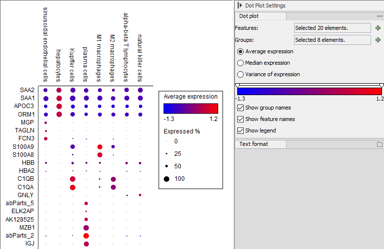
Figure 9.3: A Dot Plot visualization of data from [MacParland et al., 2018].
Each combination of gene and cell grouping is represented by a circle whose diameter is proportional to the percentage of cells in the grouping that express that gene. Note that scaling by diameter means that a gene expressed in 50% of cells will have one quarter the area of a gene expressed in 100% of cells. Good marker genes will typically be present in a large percentage of the cells for a cell type.
From the Side Panel, it is possible to change the values by which cells are colored. The options are:
- Average expression
- The average expression of cells with at least some expression of the gene.
- Median expression
- The median expression of cells with at least some expression of the gene. The median is more robust than the average in the sense that its value is less affected by outliers.
- Variance of expression
- The sample variance of cells with at least some expression of the gene. In some cases, when a grouping of cells has high variance for a gene, then this may be evidence that the grouping contains more than one population of cells. Otherwise it may indicate that the gene's expression changes rapidly.
The order in which the clusters or genes are arranged is adjustable in the Features and Groups selection. Click the green plus and use the arrows to remove, add or rearrange the order of the visualized genes or clusters. The coloring can also be changed by clicking the color gradient in the Side Panel. The relative coloring of the values can be adjusted by dragging the two knobs on the white slider above the color gradient.