Manual Annotation
The cells in a plot can be colored using different sources of information: Cell Clusters, Cell Annotations, features expression and sample of origin. To enable this coloring, the relevant elements are associated with the plot by dragging and dropping them in the corresponding groups of the Side Panel (see figure 13.1).
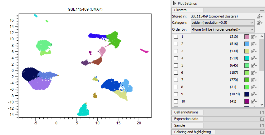
Figure 13.1: Cells are colored by clusters produced by Cluster Single Cell Data (see Cluster Single Cell Data). The category 'Leiden (resolution=0.5)' was chosen in the Side Panel Clusters group.
On mouse hover, a tool-tip shows summaries for the nearby cells (see figure 13.2). The same type of summary can be obtained for a group of selected cells by choosing 'Show Information for Selected' from the plot right-click menu (see figure 13.3).
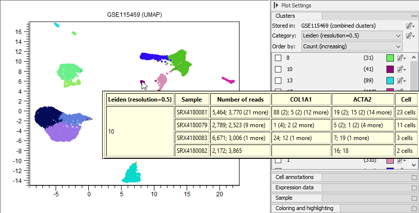
Figure 13.2: When the mouse hovers over the plot, a tool-tip is displayed summarizing the nearby cells, containing information from the elements associated to the plot, and the feature expression for any selected features.
On right-click on the plot, a series of options are available for launching tools or performing various actions on selected cells (see figure 13.3).
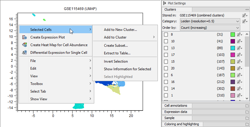
Figure 13.3: Available options in the plot right-click menu.
Selecting cells
Cells can be selected in multiple ways:
- Cells can be highlighted using the Side Panel, for example by choosing one or multiple clusters, using specific ranges for cell annotations (see figure 13.9) or feature expression (see figure 13.11), or choosing specific samples. Once the cells are highlighted, they can be selected by choosing 'Selected Highlighted' from the plot right-click menu (see figure 13.3).
- Cells can be selected using the lasso tool (see figure 13.4).
- A larger amount of cells can be selected by making a small selection and choosing 'Invert Selection' from the plot right-click menu (see figure 13.3).
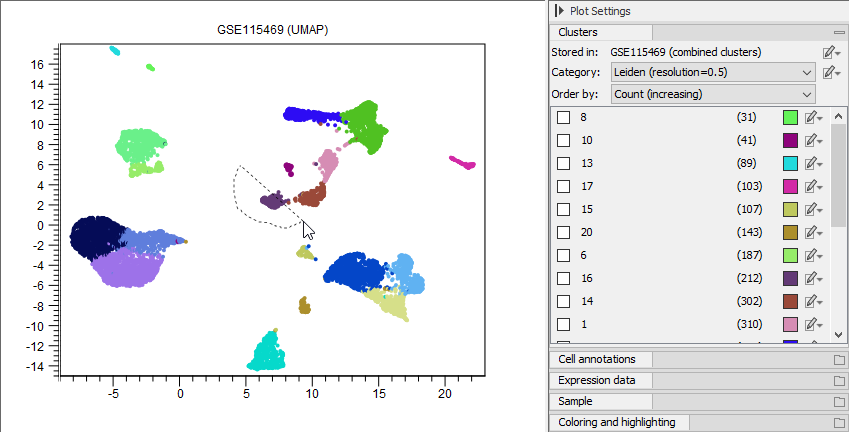
Figure 13.4: Cells can be selected using the lasso tool.
Working with clusters and annotations
Selected cells can be reassigned to existing clusters by choosing 'Add to Cluster' or added to a completely new cluster by choosing 'Add to New Cluster' (see figure 13.5) from the plot right-click menu (see figure 13.3), either as a free text or a cell type from the QIAGEN Cell Ontology (see The QIAGEN Cell Ontology).
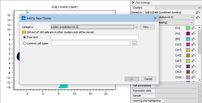
Figure 13.5: Cells can be added to a new cluster defined either by using free text or a cell type from the QIAGEN Cell Ontology by choosing 'Common cell types'. Clicking on the browse button ('...') opens up the ontology browser (see figure 13.6).
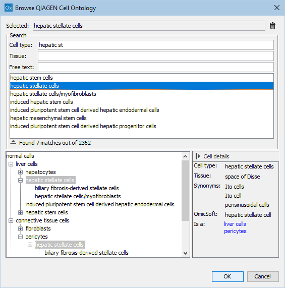
Figure 13.6: View of the QIAGEN Cell Ontology, showing details for 'hepatic stellate cells'. The 'Cell type' text field can be used to quickly identify the desired cell type. Only cell types specific to a certain tissue can be shown by filling in 'Tissue'. By using 'Free text', all cell types not containing the given text anywhere in their details are removed from the ontology structure shown at the bottom.
An existing cluster can be renamed by choosing 'Rename Cluster' in the cluster edit menu (see figure 13.7). A dialog similar to that in figure 13.5 opens, where the cluster can be renamed either using free text or a cell type from the QIAGEN Cell Ontology. When a cluster represents an ontology cell type, details about it (as those shown in figure 13.6) can be obtained by choosing 'Show in QIAGEN Cell Ontology' (see figure 13.7).
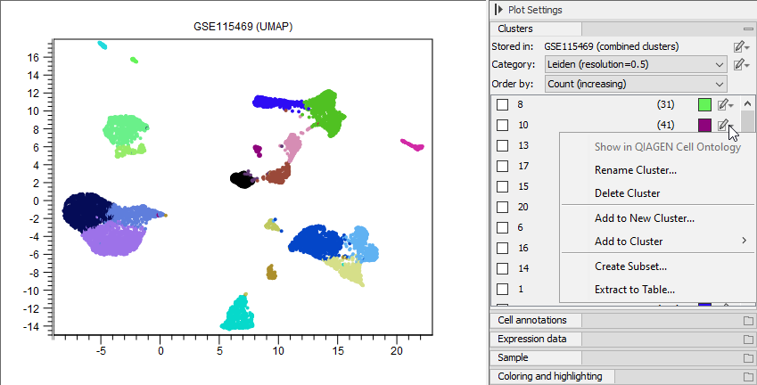
Figure 13.7: The available options for editing a single cluster from the Side Panel. 'Show in QIAGEN Cell Ontology' is grayed out because the corresponding cluster is not part of the ontology.
Any of the changes made using the above actions can be undone using the 'Undo' button. When clusters are changed, the plot name is marked with an '*' indicating that it contains an element that needs to be saved. By clicking 'Save', a new Cell Clusters element can be created.
The coloring of a cluster can be changed by clicking on the color box next to its name in the Side Panel. The newly chosen color can be saved using the View Settings, see https://resources.qiagenbioinformatics.com/manuals/clcgenomicsworkbench/current/index.php?manual=View_settings_Side_Panel.html. Note that when the plot is closed and opened again, the default color is used, and to recover the custom color, the previously saved view settings need be re-applied to the plot.
Cells can be also colored using information from cell annotations (see figures 13.8 and 13.9).
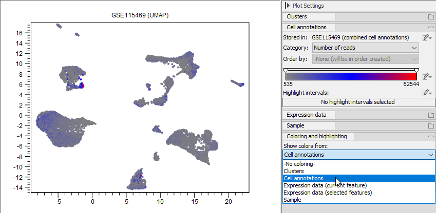
Figure 13.8: Cells are colored by the number of reads from the annotation produced by QC for Single Cell (see QC for Single Cell). What information the cells are colored by can be chosen in the group Coloring and highlighting at the bottom of the Side Panel.
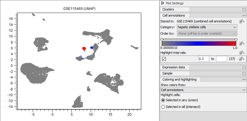
Figure 13.9: Cells are colored by the probability of having the type 'hepatic stellate cells' from the annotation produced by Predict Cell Types (see Predict Cell Type) using the human pre-trained cell classifier (see The Reference Data Manager). Cells with a probability of at least 0.3 are highlighted. The highlight interval is inclusive.
Visualizing expressions
Visualizing the expression of marker genes and selecting cells that express a set of marker genes above a specific value can be used to manually annotate the cell types. The plot can show the full expression of a specific gene across all cells using a gradient (see figure 13.10) or using one color for the cells with one or multiple gene expressions in a specific interval (see figure 13.11).
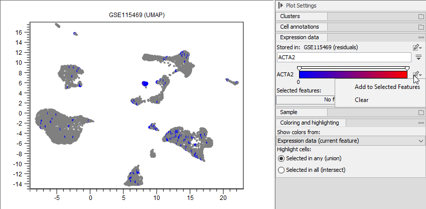
Figure 13.10: Cells are colored by the expression of 'ACTA2'. The relative coloring of the values can be changed by dragging the two knobs on the white slider above. 'ACTA2' can be added to 'Selected features' (see figure 13.11).
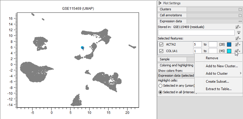
Figure 13.11: Cells that have an expression of at least 5 for 'ACTA2' and 1 for 'COL1A1' are colored in the plot. Different options are available for manipulating the cells expressing a particular feature. Selected cells can be required to express both genes, or just one of them, by choosing 'Selected in all (intersection)' or 'Selected in all (union)' at the bottom of the Side Panel. Note that the expression range is inclusive: setting the minimum expression to 0 will include the cells not expressing the gene. Choosing the interval ![]() will highlight only the cells not expression the gene.
will highlight only the cells not expression the gene.
Multiple genes can be selected by:
- Adding them manually by choosing 'Add to Selected Features', see figure 13.10.
- Loading them from a file (see figure 13.12). The file should contain one gene name per line (see figure 13.13).
- Selecting them from other views showing feature expression, see below.
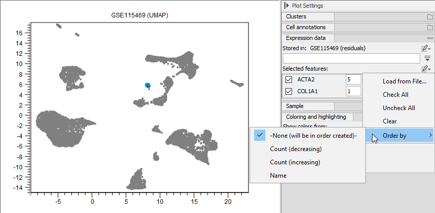
Figure 13.12: Side Panel options for 'Selected features'.
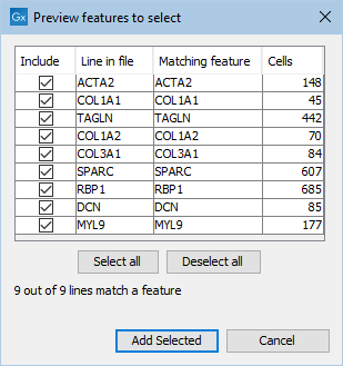
Figure 13.13: Dialog for loading feature names from a file.
Selecting features in other views
Features can be selected from various elements showing their expression, and this is done in a synchronized manner, such that all opened elements showcasing feature expression will highlight the corresponding features, if available. This can be done from an Expression Matrix (see figure 13.14), a Dot Plot (see figure 13.15), a Heat Map (see figure 13.16), or a Violin Plot (see figure 13.17).
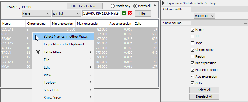
Figure 13.14: Right-click menu for selecting genes from the Expression Statistics Table view of an Expression Matrix to be synchronized with other views.
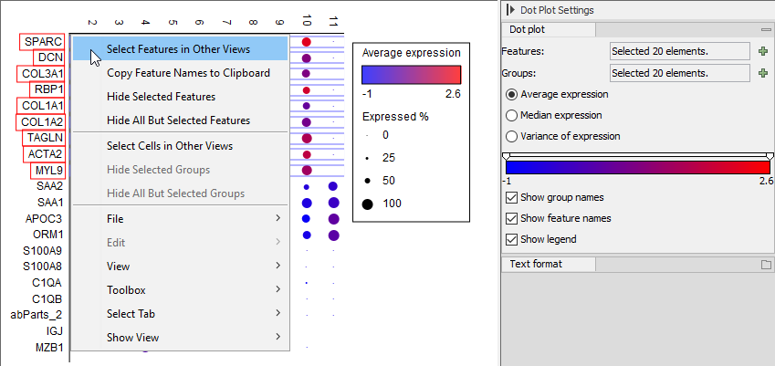
Figure 13.15: Right-click menu for selecting genes from a Dot Plot to be synchronized with other views.
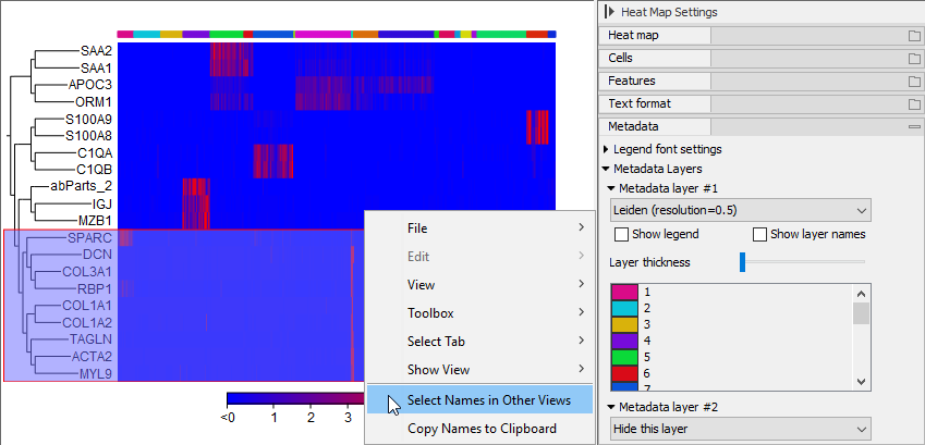
Figure 13.16: Right-click menu for selecting genes from a Heat Map to be synchronized with other views.
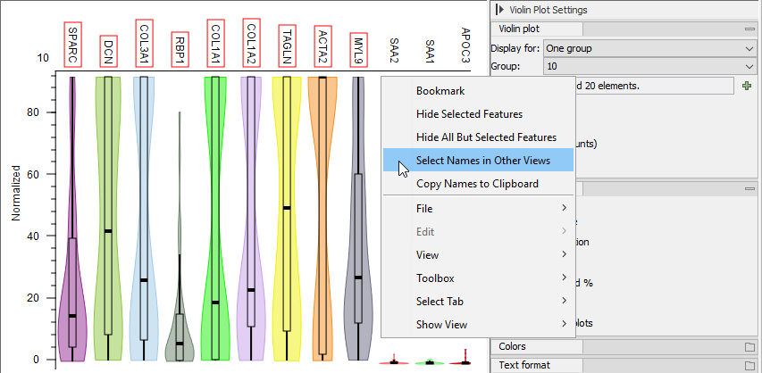
Figure 13.17: Right-click menu for selecting genes from a Violin Plot to be synchronized with other views.
The UMAP, Dot Plot, Heat Map, and Violin Plot all show that 'ACTA2', 'COL1A1', 'TAGLN', 'COL1A2', 'COL3A1', 'SPARC', 'RBP1', 'DCN', 'MYL9' are highly expressed in cluster 10. These genes were identified as markers for hepatic stellate cells [MacParland et al., 2018] and cluster 10 is confirmed to contain hepatic stellate cells by the Predict Cell Types tool (see figure 13.9). This can be further confirmed by investigating a Cell Abundance Heat Map (see Create Heat Map for Cell Abundance), as shown in figure 13.18.
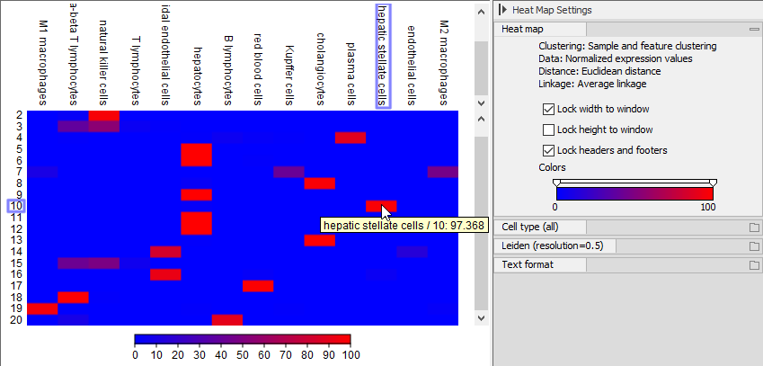
Figure 13.18: Cell Abundance Heat Map comparing the 'Leiden (resolution=0.5)' clusters to the cell types produced by Predict Cell Types. Hovering over a rectangle reveals the abundance of the selected combination.
Once the cells co-expressing specific markers are highlighted, a new cluster with the corresponding cell type can be created, as described above.