Create UMAP Plot
Uniform Manifold Approximation and Projection, UMAP, is a general purpose algorithm for visualizing high dimensional data in 2D or 3D [McInnes et al., 2018]. In the CLC Single Cell Analysis Module, it is one of two ways of constructing a Dimensionality Reduction Plot (The UMAP for Single Cell tool can be found in the Toolbox here:
Dimensionality Reduction (![]() ) | UMAP for Single Cell (
) | UMAP for Single Cell (![]() )
)
The tool takes an Expression Matrix (![]() ) as input, and offers options to run PCA or feature selection prior to the UMAP algorithm. For details on these options, please see
PCA and feature selection. The following additional options are available:
) as input, and offers options to run PCA or feature selection prior to the UMAP algorithm. For details on these options, please see
PCA and feature selection. The following additional options are available:
- Produce 3D plot. Perform a second UMAP calculation in three dimensions. As this involves a full re-calculation of UMAP in a higher dimension, the runtime is approximately doubled when this option is selected.
- Distance measure. UMAP works on a k-nearest neighbor graph, and the distance measure is used to find the `nearest' neighbors. The `1-Pearson correlation' distance is less sensitive to changes in the scale of expression between cells than Euclidean distance (for example, if one cell has exactly twice the expression of another for each gene, the `1 - Pearson correlation' distance is 0 while the Euclidean distance may be very large) and may be better at finding more distant neighbors. Conversely, Euclidean distance may provide higher resolution for distinguishing similar cell types.
- Neighborhood size. The number of cells `k' used in the k-nearest neighbor graph. This determines the granularity of the visualization. Smaller values will recover more local structure, but will lose the `big picture'. Larger values may average out fine structure.
- Random seed. The algorithm contains a random component determined by the seed. This means that each value of the seed leads to a slightly different visualization.
- Minimum distance. The effective minimum distance between embedded points. Smaller values result in tighter clusters.
- Spread. The effective scale of embedded points. Smaller values result in tighter clusters.
- Epochs. The algorithm works by repeating the same steps a predefined number of times. There is, unfortunately, no good rule for determining how many iterations are appropriate. More iterations do no harm, but too few iterations may lead to clusters of cells failing to separate. Doubling the number of iterations approximately doubles the runtime.
An example output is shown in figure 8.1.
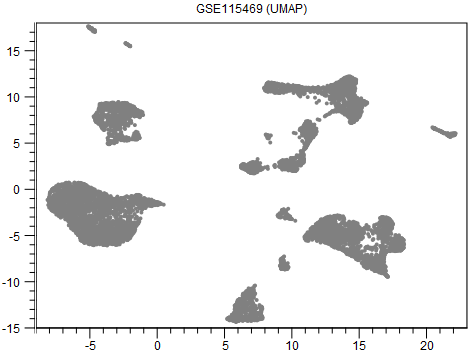
Figure 8.1: A UMAP visualization of data from [MacParland et al., 2018].
Tuning the visualization
Although reducing Spread and Minimum distance give tighter clusters, they do so in different ways. Therefore it can be useful to try changing both parameters. An example of this is given in figures 8.2-8.4.
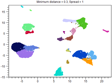
Figure 8.2: UMAP with Minimum distance = 0.3 and Spread = 1. This is the same plot as in figure 8.1, but with clusters overlaid.
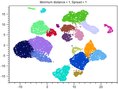
Figure 8.3: UMAP with Minimum distance = 1 and Spread = 1. The overall structure of the clusters is the same as in figure 8.2, but the points are more separated.
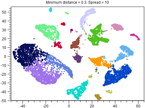
Figure 8.4: UMAP with Minimum distance = 0.3 and Spread = 10. Both points and clusters are more separated than in figure 8.2. Whether this is desirable is likely to depend on the application. For example, it is easier to see that the dark blue, light blue and orange clusters are different cell types, which may help with cell type annotation, but their proximity in the other figures may have indicated a shared developmental lineage, which it is not possible to see here. Note that other clusters, such as the red cluster, are now also split in two, compared to the other figures.