Interpreting the output of Normalize Single Cell Data
Normalize Single Cell Data produces the following outputs:
- A single Expression Matrix (
 ) named with the extension `(residuals)'.
- A single Report (
 ) providing diagnostic plots.
The Expression Matrix output
It is not possible to see the normalized expressions in the output Expression Matrix - instead the transformation is stored 'invisibly', and the output file is typically not much larger (on disk) than the inputs. Tools whose results benefit from normalized data will automatically use the transformation when available. Normalize Single Cell Data ignores any transformations already stored on its inputs, so it is safe to, for example, run the tool on a mixture of samples, some of which have already been normalized, and others of which have not.
The report
Because normalization involves fitting a model to data, bad results can be obtained when the model is inappropriate. This can be diagnosed by the residual variance plot in the report. The variance of the Pearson Residuals is expected to be ![]() after normalization for the majority of genes (because the majority are expected to have relatively stable expression across all cells in the data).
after normalization for the majority of genes (because the majority are expected to have relatively stable expression across all cells in the data).
There are several ways in which the model can be inappropriate:
- The distribution of counts is not negative binomial
- Usually this is not a problem, as the negative binomial (NB) model is quite flexible. However, the NB model is most appropriate for UMI data. Figure 5.19 shows a dataset where there are no UMIs, and where the sequencing is very deep. Normalization may still be beneficial in this case, but it is worth checking whether the plot is indicating problems with the data.
- The normalization is over-parameterized
- Each batch adds a term in the model that must be estimated from the data. The fewer cells for that batch, the more inaccurate that estimation will be.
- The model is under-parameterized
- Figure 5.20 shows the variance of Pearson Residuals after normalizing a mixture of several protocols (primarily 10X v2, 10X v3, Drop-Seq, Seq-Well and inDrop), but without fitting batch terms. Figure 5.21 shows the variance of Pearson Residuals for the same data after batch correction. The batch corrected data are more tightly clustered around the expected line.
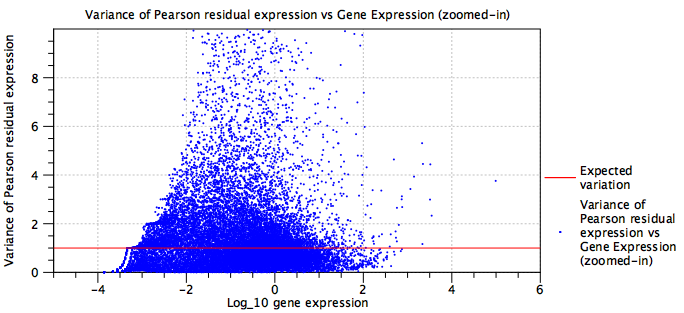
Figure 5.19: Residual variance plot for a dataset that is not well modeled by the negative binomial distribution
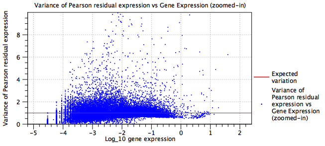
Figure 5.20: Residual variance plot for an under-parameterized model
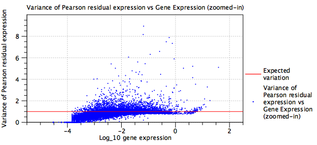
Figure 5.21: Residual variance plot for the same data as in figure 5.20 after adding batch correction terms to the model
In addition to the residual variance plot, the report contains a list of the most highly variable genes found in the data after correcting for sequencing depth and batch effects. This list should typically be enriched for marker genes of the cell types present in the data. It is sometimes possible to spot problems here. For example, if multiple samples were supplied as input to the tool, and the list was enriched for rRNA genes, then maybe some of the samples had a higher amount of rRNA. Further investigation might then reveal that the samples were prepared by two different individuals, and this might be added as a batch factor.
The remaining sections of the report plot the fitted values of each term in the model (blue points), and, when relevant, `regularized' values (red lines, see section 5.2.3 for details). These allow the number of terms in the model to be seen, which can be useful when evaluating if the model is likely to be over-parameterized. Three terms are always present - the `intercept', the sequencing depth term `log10_expression' and the dispersion term `Log10(theta)'. By double-clicking on each plot and switching to the table view, it is also possible to extract all the fitted values. Examples of such plots are shown in figure 5.22 and figure 5.23.
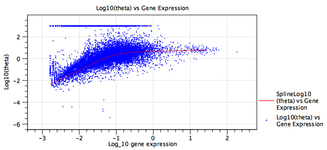
Figure 5.22: A plot of the fitted dispersion parameter, ![]() , of a model. Each blue point is a gene. The red line is a `regularized' trendline. When the average gene expression is low, the expression of some genes is consistent with a Poisson distribution, which is seen here by the band of genes at
, of a model. Each blue point is a gene. The red line is a `regularized' trendline. When the average gene expression is low, the expression of some genes is consistent with a Poisson distribution, which is seen here by the band of genes at
![]() . The trendline provides a more robust estimate of the dispersion, with
. The trendline provides a more robust estimate of the dispersion, with ![]() actually decreasing at low expression. See section 5.2.3 for more details.
actually decreasing at low expression. See section 5.2.3 for more details.
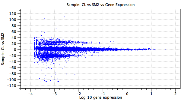
Figure 5.23: A plot of a batch effect parameter. In this example, the y-axis shows the natural logarithm of the fold change for each gene (blue point) in the `CL' sample as compared to the baseline `SM2' sample. There is no `regularized' trendline. The large fold changes concentrated in two bands at ![]() and
and ![]() are due to genes that are expressed in only one sample, or in neither.
are due to genes that are expressed in only one sample, or in neither.