Workflow visualization
Layout
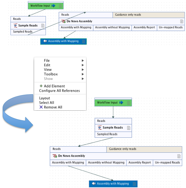
The workflow layout can be adjusted automatically, with right-clicking anywhere in the canvas and choosing the option "Layout" (figure 12.19), or with the quick command Shift + Alt + L. Note that only elements that have been connected will be adjusted.

Figure 12.19: A workflow layout can be adjusted automatically with the "Layout" function.
It is very easy to make an image of the workflow. Simply select the elements in the workflow (this can be done pressing Ctrl + A, by dragging the mouse around the workflow while holding down the left mouse button, or by right clicking in the editor and then selecting "Select All"), then press the Copy button in the toolbar (![]() ) or CTRL + C. Press Ctrl + V to paste the image into the wanted destination, such as an email or a text or presentation program.
) or CTRL + C. Press Ctrl + V to paste the image into the wanted destination, such as an email or a text or presentation program.
Configuration Editor
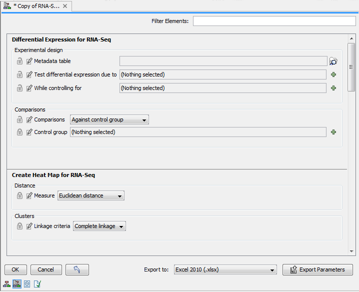
Instead of configuring the various tools individually, the Configuration Editor enables the specification of all settings, references, masking parameters etc. through a single wizard window (figure 12.20). This editor is accessed through the (![]() ) icon located in the lower left corner.
) icon located in the lower left corner.

Figure 12.20: Use the Configuration Editor to edit configurable parameters for all the tools in a given Workflow.
Side Panel
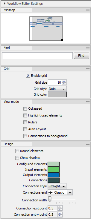
In the workflow editor Side Panel, you will find the following workflow display settings (figure 12.21):
- Minimap. Use to navigate really large and complex workflows.
- Find. Counts how many times a search term is present in the workflow. Clicking on Find highlights the instances by changing the perimeter of the element from a full line to a dash line.
- Grid. Displays a grid on the canvas, and customizes the spacing, style and color of the grid. Per default, a grid is shown, and the workflow elements snap to the grid when they are moved around.
- View mode
- Collapsed. Collapses elements of the workflow for simplified visualization of the workflow (useful for large workflows).
- Highlight used elements. Grays out unused elements (also possible with shortcut Alt + Shift + U).
- Rulers. Adds vertical and horizontal rules on the canvas.
- Auto Layout. Rearranges automatically newly added and connected elements.
- Connections to background. Places connecting arrows are shown behind elements to make it easier to read elements and parameters names.
- Design
- Round elements. Rounds corners of element boxes.
- Show shadow. Adds shadows under element boxes.
- Coloring. Customizes background color (see here) for a description of the different categories).
- Connection style. Customizes connection arrows.

Figure 12.21: The Side Panel of the workflow editor.
Viewing the flow of elements in a workflow
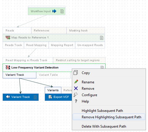
Following the path through a workflow from a particular element can help when authoring complex workflows. To highlight the path through the workflow from a particular element, right-click on the element name and select the Highlight Subsequent Path option from the context specific menu (figure 12.22). Select Remove Highlighting Subsequent Path to remove the highlighting.

Figure 12.22: All elements connected downstream of a selected element are highlighted after selecting the Highlight Subsequent Path menu option.
