Heat map
The two dimensional heat map shows expression levels. Each column corresponds to one sample, and each row corresponds to a feature (gene or miRNA). The samples and features are both hierarchically clustered. The attribute values on which the analysis was performed are added as an overlay (figure 50).
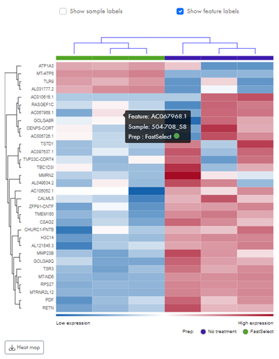
Figure 50: Hover over fields in the heat map to see feature and sample names.
The coloring of the heat map fields indicate expression values of the individual features. Blue colors signify low expression and red colors signify high expression. Hover over an field to see the feature and sample name.
Download heatmap. To download the heatmap, hover the plot and click on Heatmap.