Workflow creation helper tools
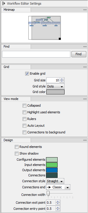
In the workflow editor Side Panel, you will find the following workflow display settings that can be useful to know (figure 9.28):- Grid
- Enable grid You can display a grid and control the spacing and color of the grid. Per default, the grid is shown, and the workflow elements snap to the grid when they are moved around.
- View mode
- Collapsed The elements of the workflow can be collapsed to allow a cleaner view and especially for large workflows this can be useful.
- Highlight used elements Ticking Highlight used elements (or using the shortcut Alt + Shift + U) will show all elements that are used in the workflow whereas unused elements are grayed out.
- Rulers Vertical and horizontal rules can be visualised
- Auto Layout Ticking Auto Layout will ensure rearrangement of elements once new elements are added.
- Connections to background Connecting arrows are shown behind elements. This may easy reading of element names and accessible parameters.
- Design
- Round elements Enable rounding of the element boxes.
- Show shadow Shadows of element boxes can be added.
- Configured elements Background color can be customized.
- Inpupt elements Background color can be customized.
- Edges Color of connecting arrows can be customized.

Figure 9.28: The Side Panel of the workflow editor.
