Target-level log2-ratios
The target-level coverage log-ratios are presented as a graph. An example is shown in figure 21.39. On the horizontal axis, the targets are placed in the order in which they appear in the genome. On the vertical axis, the adjusted coverage log-ratio of each target is plotted. The black line represents the actually observed mean adjusted log-ratio of coverage for each target. The cyan and red lines represent the 95% confidence intervals of the expected mean adjusted log-ratios of coverages, based on the statistical model. Chromosome boundaries are indicated as vertical lines.
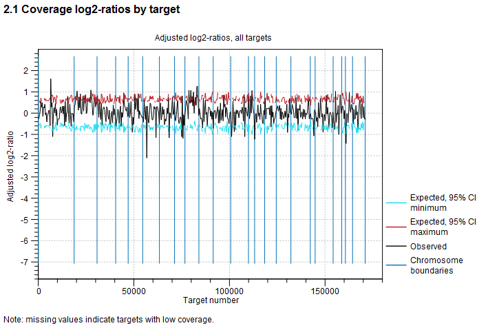
Figure 21.39: An example graph showing the mean adjusted log-ratios of coverages in the report produced by the Copy Number Variant Detection tool. In this example, the second and ninth chromosomes are amplified, and the log-ratios of coverages of targets on these chromosome are significantly higher than for targets on other chromosomes. The black line in these regions is outside the boundaries defined by the cyan and red lines.