Output from Detect Regional Ploidy
The tool produces the following outputs:
- Target-level Ploidy Track A target region track where estimated ploidy is annotated to each of the original target regions in the target regions track provided to Detect Regional Ploidy. In addition, ploidy results are also provided for database/germline variants located in target regions.
- Region-level Ploidy Track A region-level track where adjacent target regions with the same estimated ploidies are collapsed to longer regions.
- Report A report providing the estimated purity, the normalization factor, an overview of identified target states as well as plots for log scaled fold changes and identified allele frequencies.
Target-level Ploidy Track
The target-level ploidy track contains the target regions and variants annotated with ploidy information. For target regions, original annotations from the copy number variant detection tool are also retained. The following columns have been modified or added by Detect Regional Ploidy:
- Name lists the type of information provided in the respective row:
- Coverage ratio rows contain target level coverage information from a copy number variation tool and ploidy results from Detect Regional Ploidy.
- Variant Allele frequency rows contain ploidy results as well as count and coverage.
- Reference allele rows contain ploidy results as well as the population frequency if provided in the variant database track.
- Adjusted RLR is the relative log ratio adjusted by the normalization factor.
- LOH provides information about whether the estimated state can be considered LOH or not (Yes or No). LOH is characterized by loss of one chromosome, whereas the other chromosome is present in one or more copies.
- State is the predicted ploidy state.
- For columns Normal diploid to (2,4), each column represents a target state. For example, Uniparental disomy represents the state where two identical chromosomes are present, and (1,3) represents the state where one chromosome is present in one copy and the other is present in three copies. For a given target region or variant, the predicted state is denoted with a 1 in the relevant column.
- Count is the variant count from the provided somatic variant track.
- Coverage is the variant coverage from the provided somatic variant track.
- Population frequency is the population frequency from the variant database. If germline variants are provided instead of a variant database this column is not included.
Region-level Ploidy Track
The region-level ploidy track contains predicted region level ploidy states where target regions with the same ploidy state have been collapsed to one region. In addition to chromosome and region, the track contains the following information:
- Name contains the predicted ploidy state of the region.
- LOH provides information about whether the estimated state can be considered LOH or not (Yes or No). LOH is characterized by loss of one chromosome, whereas the other chromosome is present in one or more copies.
- Number of targets is the number of original target regions included in the collapsed region.
Detect Regional Ploidy algorithm report
The purity and normalization factor table shows the estimated purity and normalization factor along with confidence intervals. Low purity or a wide confidence interval for purity is an indication that the regional ploidy predictions are uncertain. In the target regions table the number of targets predicted to be in each ploidy state is shown.
The log coverage ratio plots give a genome-wide overview over detected ploidy states and variant frequencies. There are plots for all chromosomes (Figure 11.7), and individual chromosomes with at least one target. The x-axis is the genomic position, the y-axis is the fold change. Vertical lines separate chromosomes, and the striped line shows average coverage. There are points for each input target with colors and shapes based on their calculated ploidy states. Plots come in pairs. The second plot shows variant frequencies. This plot is similar to the above one, but the y-axis is variant allele frequencies. There are points for each input somatic variant with colors and shapes based on their calculated ploidy states.
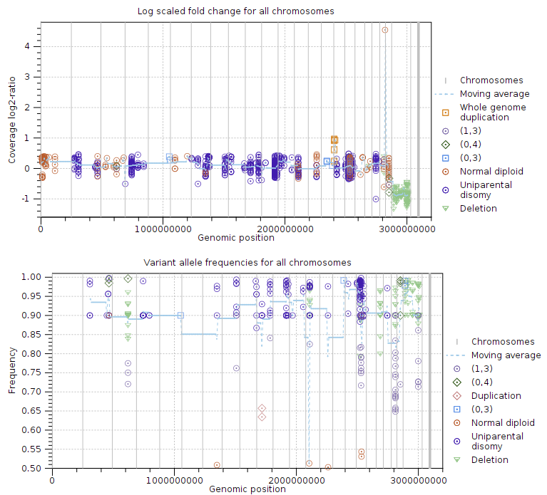
Figure 11.7: Log-coverage ratios for CNV targets and variant allele frequencies for somatic variants.
The next two subsections provide information useful for diagnosing potential problems with LOH detection. First, the expected coverage log-ratios for each ploidy state are shown along with the average coverage log-ratios for targets predicted to have this state. The expected coverage log-ratios are simply computed as in table 11.2 based on the estimated purity. Below the table is a plot with coverage log-ratios plotted against the base coverage. The points are colored by their predicted state and horizontal lines indicate the expected log-coverage ratio for each state (Figure 11.8).
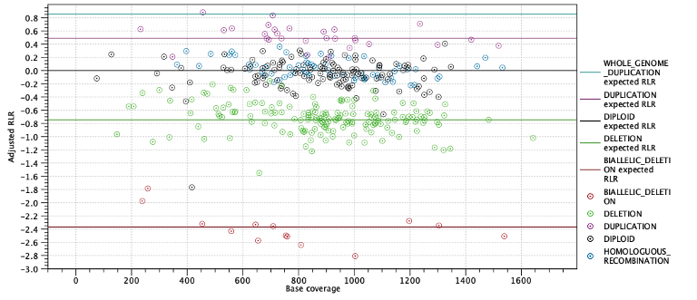
Figure 11.8: Log-coverage ratios for each target with horizontal lines indicating the expected log-coverage ratio.
Second, the expected allele frequencies for each ploidy state are shown along with the average allele frequency for variants predicted to have this state. Again the expected allele frequencies are computed as in table 11.3 based on the estimated purity. Below the table is a plot with allele frequencies plotted against their coverage. The points are colored by their predicted state and horizontal lines indicate the expected allele frequency for each state (Figure 11.9).
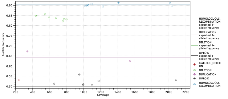
Figure 11.9: Allele frequencies for each putative heterozygous variant with horizontal lines indicating the expected allele frequencies.