Create Heat Map for Abundance Table
The hierarchical clustering groups features by the similarity of their genomes over the set of samples, and clusters samples by the similarity of genomes over their features. Each clustering has a tree structure that is generated as follow:
- The tool considers each feature or sample to be a cluster.
- It calculates pairwise distances between all clusters, and join the two closest clusters into one new cluster.
- This process is repeated until there is only one cluster left, which contains all the features or samples.
- The tree is then drawn so that the distances between clusters are reflected by the lengths of the branches in the tree.
The Create Heat Map for Abundance Table tool uses the TMM normalization described in (described in http://resources.qiagenbioinformatics.com/manuals/clcgenomicsworkbench/current/index.php?manual=RNA_seq.html) to make samples comparable, then does a z-score normalization to make features comparable.
To create a heat map:
Metagenomics (![]() ) | Abundance Analysis (
) | Abundance Analysis (![]() ) | Create Heat Map for Abundance Table (
) | Create Heat Map for Abundance Table (![]() )
)
Select an abundance table with more than one sample as input (i.e., an OTU table table, or a merged functional or profiling table) and specify a distance measure and a cluster linkage (figure 9.9). The distance measure is used to specify how distances between two features or samples should be calculated. The cluster linkage specifies how the distance between two clusters, each consisting of a number of features or samples, should be calculated. Learn more about how distances and clusters are calculated at http://resources.qiagenbioinformatics.com/manuals/clcgenomicsworkbench/current/index.php?manual=Clustering_features_samples.html.
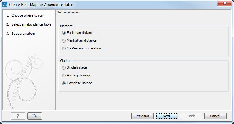
Figure 9.9:
Select an abundance table.
After having selected the distance measure, set up the feature filtering options (figure 9.10).
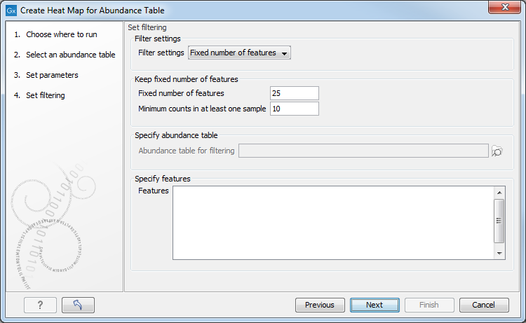
Figure 9.10:
Set filtering options.
Indeed, genomes usually contain too many features to allow for a meaningful visualization. Clustering hundreds of thousands of features is also very time consuming. Therefore it is recommend to reduce the number of features before clustering and visualization. There are several different filter settings:
- No filtering: Keeps all features.
- Fixed number of features:
- Fixed number of features: The given number of features with the highest coefficient of variation (the ratio of the standard deviation to the mean) are kept.
- Minimum counts in at least one sample: Only features with more than this number of counts in at least one sample will be taken into account. Notice that the counts are raw, un-normalized values.
- Abundance table: Specify a subset of an abundance table in case you only want to display the heat map for that particular subset. Note that creating the heat map from the subset abundance table directly can not ensure proper normalization of the data, and it is therefore recommended to use the original abundance table as input and filter using this option.
- Specify features: Keeps a set of features, as specified by plain text, i.e., a list of feature names. Any white-space characters, as well as "," and ";" are accepted as separators.
The tool generates a heat map showing the abundance of each feature in each sample and showing the sample clustering and/or feature clustering as a binary tree over the samples and features, respectively (figure 9.11).
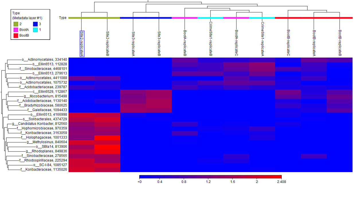
In order to create a heat map with a specific taxonomic level information, it is possible to use the option "Aggregate feature" in the right hand side panel of the Abundance table. When aggregating an abundance table, by class for example , a new column called "Class (Aggregated)" containing the class names is now created. This name will then be used when creating a Heat Map. This is done in order to avoid very long feature names in abundance tables and downstream analysis tools.