Compare Immune Repertoires
Using the Compare Immune Repertoires we can compare properties such as diversity and similarity of the immune repertoires characterized by Immune Repertoire Analysis.
To run Compare Immune Repertoires go to the Toolbox and select:
Tools | QIAseq Panel Expert Tools (![]() ) | QIAseq Immune Repertoire Expert Tools (
) | QIAseq Immune Repertoire Expert Tools (![]() ) | Compare Immune Repertoires (
) | Compare Immune Repertoires (![]() )
)
This opens a dialog where Immune Repertoires (![]() ) generated by the Immune Repertoire Analysis tool to be compared can be selected.
) generated by the Immune Repertoire Analysis tool to be compared can be selected.
Output from Compare Immune Repertoires tool
Three outputs can be generated by the Compare Immune Repertoires tool
- Compare Immune Repertoires Report A report containing comparisons of repertoire summary statistics, diversity, etc.
- Heat map A heat map with similar repertoires clustered.
- Similarity table A table showing the similarity of the immune repertoires for each pair of samples.
Compare Immune Repertoires Report
The Compare Immune Repertoires report contains the following sections:
- Summary A summary table showing the total number of clonotyped reads from each sample, as well as the clonotyped reads from each TCR chain for each sample.
- Diversity indices A table showing the diversity metrics Observed diversity, Extrapolated diversity (chaoE) and Extrapolated Shannon-Wiener index (chaoE) described in 8.2.2.
Additionally, the table contains the diversity metric Interpolated to lowest sample diversity, showing an estimate of the diversity if all the samples had the same number of clonotyped reads as the sample with the lowest number of clonotyped reads.
- Scatter plots If exactly two repertoires are compared, this section will contain four scatter plots with the expressions of clonotypes in the two samples.
The scatter plots are divided by TCR chain.
Only clonotypes shared between the two repertoires will be represented in the plot.
A distinct clonotype is characterized by its chain, V-segment, J-segment and CDR3 sequence.
The expression of each clonotype is shown as its relative frequency, i.e. the clonotypes count divided by the total of counts for the chain.
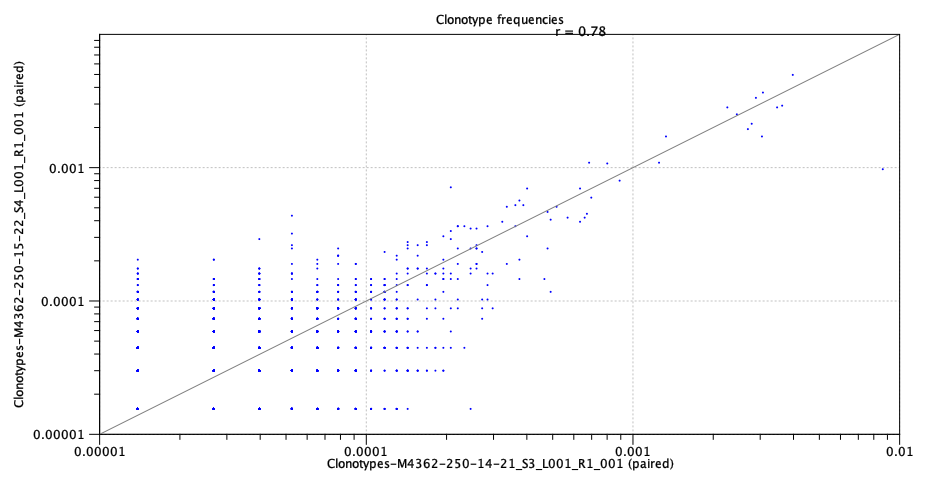
Figure 8.5: Scatter plot with clonotype expression for a particular TCR chain. - Rarefaction A plot with rarefaction curves, also known as species accumulation curve.
It shows the expected number of different clonotypes discovered as a function of the total number of clonotyped reads for a particular chain.
The curve is extrapolated to twice the total number of clonotyped reads for the most abundant sample.
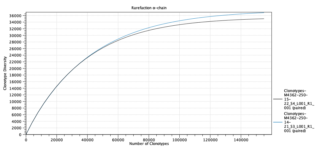
Figure 8.6: Rarefaction or species accumulation curve. - CDR3 length A table comparing summary statistics of the CDR3 lengths for the different samples for each TCR chain.
The CDR3 lengths are also shown in a box plot.
- V and J usage A total of eight bar plots showing the V and J segment usage for each sample and for each TCR chain.
Heat map
For each pair of samples the weighted Jaccard similarity between the two is computed.
Let ![]() ,
, ![]() denote the relative frequencies of the
denote the relative frequencies of the ![]() 'th clonotype in the first and second sample respectively.
The weighted Jaccard similarity is defined as,
'th clonotype in the first and second sample respectively.
The weighted Jaccard similarity is defined as,
The weighted Jaccard distance is defined as,
| (8.2) |
Based on the Jaccard distance a heat map is created with the samples clustered hierarchically.
Similarity table
A table showing the Jaccard similarity (eq. 8.1) between each pair of samples.