Taxonomic Profiling abundance table
The Taxonomic profiling abundance table lists the taxa identified in your sample. To go beyond single sample view, use the Merge Abundance Tables tool to create a multi-sample abundance table (Merge Abundance Tables). Some of the options mentioned below are relevant for such multi-sample abundance tables only.
The abundance table can be vizualized in Table view (![]() ), Stacked Visualization view (
), Stacked Visualization view (![]() ), and Sunburst view (
), and Sunburst view (![]() ).
).
Table view (![]() )
)
The table displays a number of columns, some of which are available only when the table is not aggregated by taxonomy (figure 5.10):
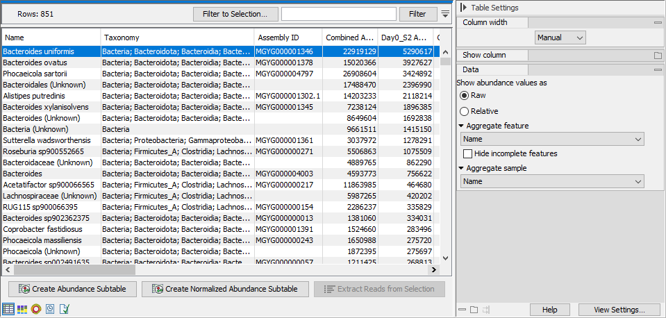
Figure 5.10: Taxonomic profiling abundance table.
- ID. The ID of the reference genome or taxon.
- Name. The name of the taxon as specified by the reference database.
If the name contains the text "(Unknown)", this indicates that the taxon corresponds to a higher-level node in the taxonomy, and that this node had a significant amount of reads associated to ancestor taxa that are present in the database but were disqualified. This indicates that there was some organism in the sample for which there is no exact match in the reference database, but is most likely closely related to this taxon. If the name does not contain the text "(Unknown)", it means that the sample contains this exact taxon. - Taxonomy: The taxonomy of the taxon as specified by the reference database.
- Assembly ID: The ID of the assembly as specified by the reference database. Typically a GenBank assembly accession number.
- Combined Abundance: Total abundance across samples.
- Min, Max, Mean, Median and Std. Minimum, maximum, mean, median and standard deviation of abundance values across samples.
- Abundance. Number of reads assigned to the taxon as counted during the quantification phase, see Taxonomic Profiling. If the option Adjust for read length variation is checked, the abundance value will be adjusted by weighing the reads assigned to a taxon by the total number of nucleotides mapped to the taxon:
- Adjusted abundance = (abundance in nucleotides) / (average mapped read length)
- Coverage: The coverage estimate of the sample. Coverage calculation depends on the representation of the taxon:
- The taxon is represented by a single-sequence genome:
- Coverage = (Weighted nucleotides matching the genome sequence) / (genome sequence length).
The weight is adjusted based on the number of ambiguous matches for the individual reads. A unique match equals a maximum weight of 1.
- Coverage = (Weighted nucleotides matching the genome sequence) / (genome sequence length).
- The taxon is represented by a multi-sequence genome:
- Adjust for read length variation is checked: Coverage = (total number of nucleotides assigned to the genome sequences) / (total genome sequence length).
- Adjust for read length variation is unchecked: Coverage = ((total number of reads assigned to the genome sequences) x (average sample read length)) / (total genome sequence length).
- The taxon is a parent of filtered, unqualified genomes. The reads from the filtered genomes were reassigned to the parent taxon:
- Adjust for read length variation is checked: Coverage = (total number of nucleotides initially assigned to the filtered genomes) / (average sequence length of filtered genomes).
- Adjust for read length variation is unchecked: Coverage = ((total number of reads initially assigned to the filtered genomes) x (average sample read length)) / (average sequence length of filtered genomes).
- The taxon is represented by a single-sequence genome:
The Side panel offers the following settings:
- Show abundance values as. Switch between Raw and Relative abundance. Relative abundance is calculated as: Relative abundance = (Abundance) / (Sum of abundances).
- Aggregate feature. Select a taxonomic level to aggregate abundance values by. For example, select Family to display abundance values per Family as opposed to per genome.
- Hide incomplete features. Hides features that are not resolved to the taxonomic level selected with the option above.
- Aggregate sample. Select a metadata attribute to aggregate samples with same metadata value into one column with combined abundance values.
Below the table, the following actions are available:
- Create Abundance Subtable. Creates a table containing only the selected rows.
- Create Normalized Abundance Subtable. Creates a table with all rows normalized by the values of a single selected row. The row used for normalization will disappear from the new abundance table. The normalization scales the abundance table linearly, where the scaling factor is calculated by determining the average abundance across all samples and for each sample scale it to the average for the reference. Note that to be enabled, all abundance values in the selected rows must be larger than zero.
- Extract Reads from Selection. Extracts reads that were uniquely associated with the selected rows. This option is available if you selected the output Reads matching the reference database in the Taxonomic Profiling tool dialog.
Stacked Visualization view (![]() )
)
The Stacked Vizualization view displays the relative abundance of each feature. Use the Side panel setting Bar type to switch between Bar Chart (figure 5.11) and Area Chart (figure 5.12). Different colored bars or areas represent different features. A column represents a sample or - if aggregated by sample level - a group of samples.
Hold your pointer over an area to have the full taxonomy and abundance value displayed in a tooltip.
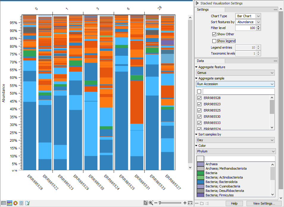
Figure 5.11: Stacked bar chart.
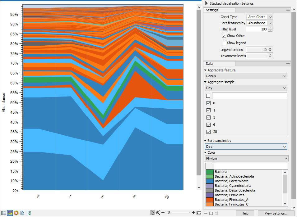
Figure 5.12: Stacked area chart.
You can adjusted the view further via the Side panel settings. Selected options are:
- Aggregate feature. Select a taxonomic level to aggregate abundance values by. For example, select Family to have each section in the plot represent a Family instead of a genome.
- Aggregate sample. Select a metadata attribute to aggregate samples with same metadata value into one column with combined abundance values. (Relvant for multi-sample abundance tables only). Use the checkboxes below to specify which samples or groups of samples to include in the plot.
- Sort samples by. Select a metadata attribute to sort samples by the corresponding attribute values. The values are listed above the plot (figure 5.11).
- Color. Select a taxonomic level to color the plot by. As an example, if you select Phylum, all features belonging to the same Phylum will get different shades of the same base color.
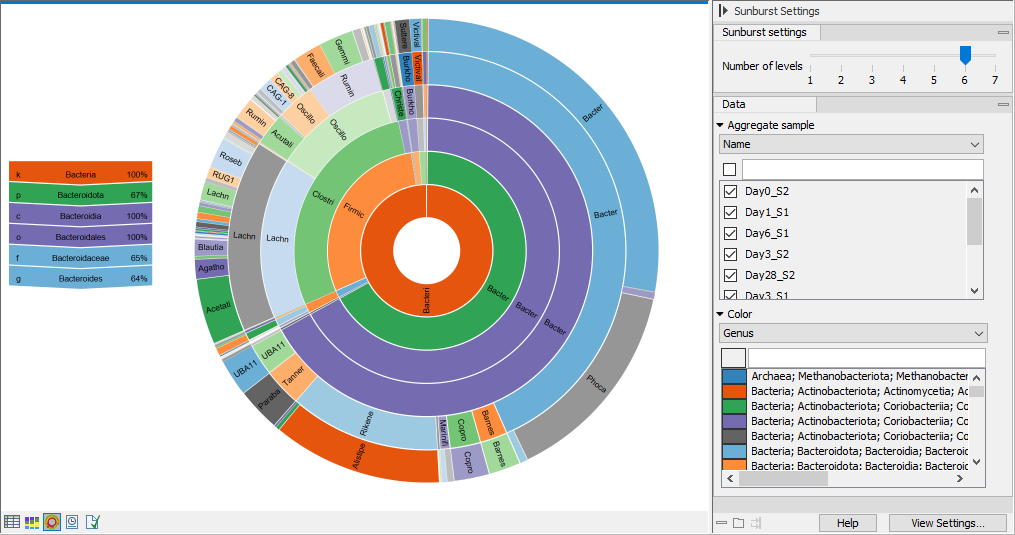
Sunburst view (![]() )
)
The plot is zoomable. Click on a section to zoom in and render the plot with this section at the center. Click on the center of the plot to zoom out one level at a time.
Hold your pointer over the plot to have the legend reflect the highlighted section (figure 5.13).
Use the Side panel settings to adjust the plot:
- Number of levels. Select the maximum number of taxonomic levels to display.
- Aggregate sample. Select a metadata attribute to group aggregate samples by, and use the checkboxes below to specify which samples or groups of samples to include in the plot.
- Color. Select a taxonomic level to color the plot by. Lower levels will inherent the color and get different shades of the same color.