Customizing the Workflow Editor
The Workflow Editor side panel (figure 13.27) contains settings that can make navigating through and editing workflows easier. They can be particularly useful when working with large workflows.
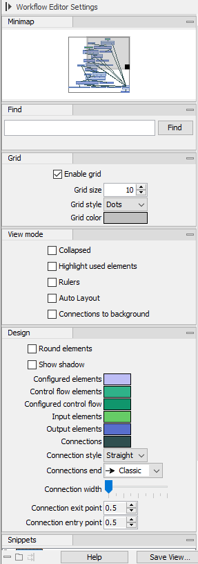
Figure 13.27: The Workflow Editor side panel
The Workflow Editor side panel contains the following:
- Minimap
- A zoomed-out overview of the workflow. The darker grey box in the minimap highlights the area of the workflow visible in the editor. Drag that box within the minimap to quickly navigate to a specific area in the editor. The location of this dark grey box is updated when you navigate to another area of the workflow.
- Find
- Search for workflow elements based on names.
After you enter a term and click on the Find button, the number of elements found with the term in their name is reported below the search field. The elements identified are highlighted in the workflow editor (figure 13.28). When multiple elements were found, the view will update so the first element found is visible in the editor. Click on the Find button again to bring the second element into view. Click on Find again to bring the third element into view, and so on.
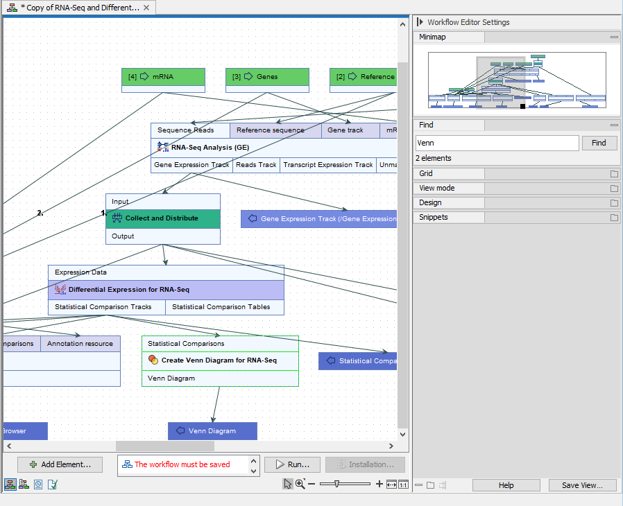
Figure 13.28: Two elements with names including the term "venn" were found using the Find tool in the side panel. Both are visible in this view, with the first element found highlighted. - Grid
- Customize the spacing, style and color of the symbols used in the grid on the canvas, or choose not to display a grid. Workflow elements snap to the grid when they are added or moved around.
- View mode
- Settings under the View tab are particularly useful when working with large workflows, as they can be used to remove aspects of the design that are not of immediate interest.
- Collapsed Enable this to hide the input and output channels of workflow elements (figure 13.29).
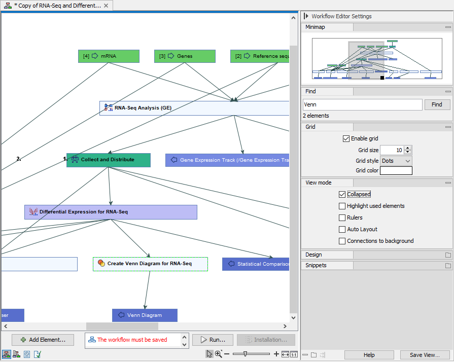
Figure 13.29: The same workflow as above but with the "Collapse" option in the View mode settings enabled. - Highlight used elements. Enabling this option results in elements without at least one input and one output connection to appear faded. Elements connected to those missing connections are also faded (figure 13.30). (Shortcut: Alt + Shift + U)
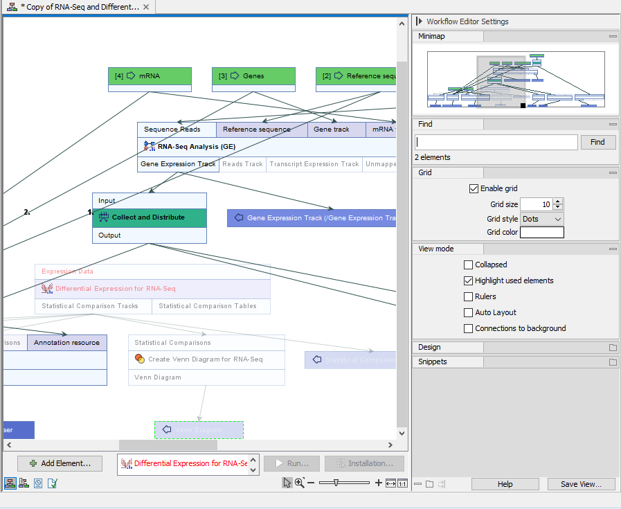
Figure 13.30: A similar workflow to those above but with the "Highlight used elements" option in the View mode settings enabled. The faded coloring makes it easy to spot that the workflow arm starting with Differential Expression for RNA-Seq is not connected to the rest of the workflow. - Rulers Adds rules along the left vertical and top horizontal edges of the canvas.
- Auto Layout Enable this option to adjust the layout automatically every time an element is added and connected. Depending on the workflow design, using the "Layout" option in the right-click menu over the canvas can be preferable (see Adjusting the workflow layout).
- Connections to background Enable this to put connection lines behind workflow elements (figure 13.31).
See also the Design options, described below, where you can change the color and design of connections.
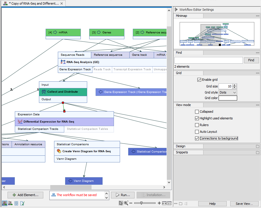
Figure 13.31: A similar workflow to those above but with the "Connections to background" option in the View mode settings enabled.
- Collapsed Enable this to hide the input and output channels of workflow elements (figure 13.29).
- Design
- Options under the Design tab allow the shapes and colors of element and connections to be defined. Of particular note is the ability to color elements with non-default configurations differently to those with default settings.
- Round elements Round the corners of elements.
- Show shadow Add shadows under elements.
- Coloring Customize element background colors. Default colors assigned to different types of elements can be specified, and elements with non-default configurations can be assigned a different color to elements with default configurations (figure 13.32). See Anatomy of workflow elements ) for information on element categories.
- Connection related options Customize connection lines between elements, including whether they should be straight or elbow lines, their width and where they should enter and exit elements.
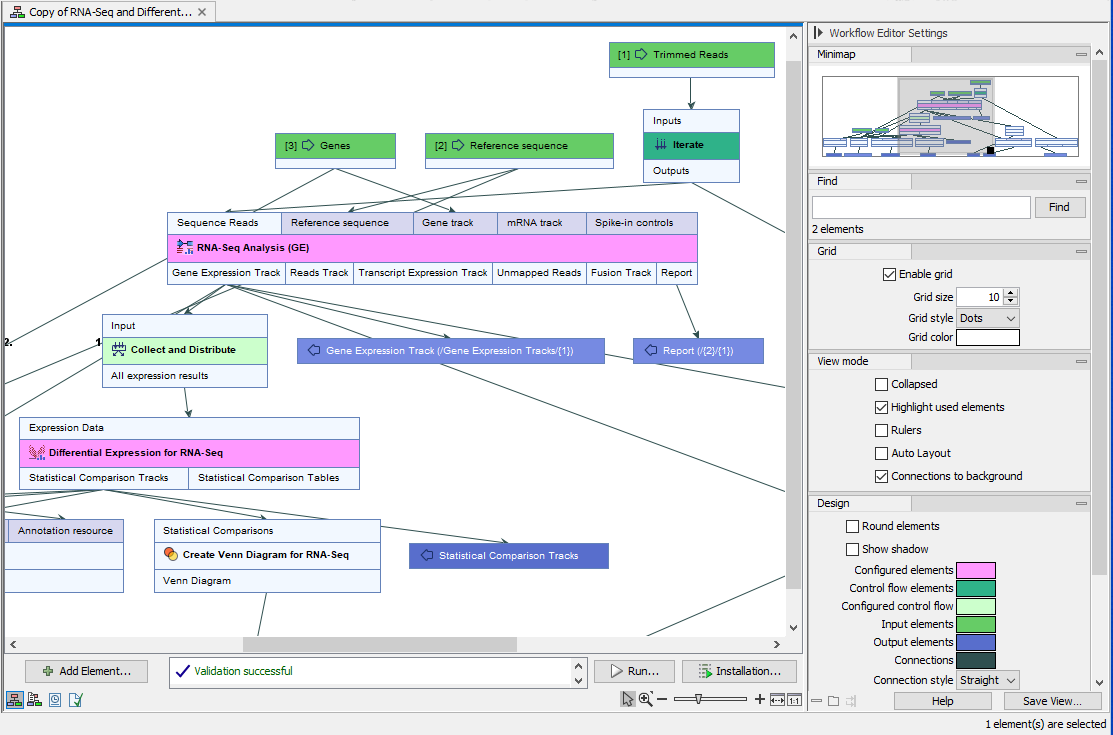
Figure 13.32: A similar workflow to those above, but where standard elements with non-default configuration have been assigned the color pink and control flow elements with non-default configurations have been assigned a pale green color, making them easy to spot. - Snippets
Snippets are sections of workflows, which have been saved and can be easily added to a new workflow. These are described in Snippets in workflows.
