The output of Normalize Single Cell Data
Normalize Single Cell Data produces the following outputs:
- A normalized Expression Matrix (
 ) / (
) / ( ). It is not possible to see the normalized expressions directly in the matrix. Downstream tools automatically use them when available.
- Optionally, a Report (
 ) providing a summary and diagnostic plots.
The report includes the following sections.
Summary
Contains a table with:
- Target genes. The number of genes for which the model was fitted.
- Not fitted genes. The number of genes for which the model fit failed.
Variation of normalized expressions
Contains the following subsections:
- Variance of Pearson residual expression. A plot containing the residual variance. Since most genes are expected to have relatively stable expression across all cells, the residual variance is expected to be ~1 for the majority of genes. The plot is useful for determining if the model is inappropriate for the data. This can happen in several ways:
- The distribution of expressions is not negative binomial (NB). The NB model is most appropriate for UMI data. Figure 7.26 shows a dataset without UMIs and with very deep sequencing. Even if the NB model might not be a perfect fit, normalization may still be beneficial, but it is important to check whether the plot indicates problems with the data.
Usually this is not a problem, as the negative binomial (NB) model is quite flexible. but if it doesn't fit an NB it might still be good enough.
(I don't think it matters, but if it doesn't fit an NB it might still be good enough. You can use the wrong distribution and get satisfactory results e.g. normal distribution for people's heights

Figure 7.26: Residual variance plot for data without UMIs, which is not modeled well by the negative binomial distribution. - The normalization is over-parameterized. The model includes a term for each batch, which is estimated from the data. The fewer the cells in a batch, the less accurate the estimation will be.
- The model is under-parameterized. Figure 7.27 illustrates the effect of batch correcting data containing a mixture of multiple protocols. Without batch correction (plot to the left), the points deviate more noticeably from the expected line. In contrast, for the batch corrected data (plot to the right), the points are more tightly clustered around the expected line.
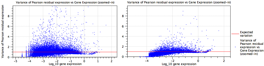
Figure 7.27: Residual variance plots for data containing a mixture of several protocols. Left: No batch correction is performed and the model is under-parameterized. Right: Batch correction is performed.
- The distribution of expressions is not negative binomial (NB). The NB model is most appropriate for UMI data. Figure 7.26 shows a dataset without UMIs and with very deep sequencing. Even if the NB model might not be a perfect fit, normalization may still be beneficial, but it is important to check whether the plot indicates problems with the data.
- Highly variable genes. A table with the most highly variable genes found in the data after normalization. This list should typically be enriched with marker genes representing the cell types present in the data.
It can also provide insights into potential issues. For example:
- If multiple samples were supplied as input, and the list contains many rRNA genes, it could indicate that some samples had higher rRNA content. Further investigation might reveal that the samples were prepared by two different investigators, suggesting the need to include this as a batch factor.
- If batch correcting for cell cycle effects, and the list contains many genes known to have a role in the cell cycle, it could indicate that batch correction was not successful.
Fitted values
The remaining sections of the report contain the fitted values for each model term: 'Intercept', 'Log10(theta)' (figure 7.28), and a term for each batch effect (figure 7.29).
These sections can be useful for assessing whether the model is likely over-parameterized, as it easy to see the number of terms. Each section contains a plot with the fitted values and, where relevant, the regularized trend.
The plots for the batch effect terms show the fold change for the corresponding batch relative to the baseline (figure 7.29). It can be useful to inspect the fold change of individuals genes. For this, open the plot outside the report by double-clicking on it, switch to the table view (![]() ), and sort the table by fold change. For example, when correcting for cell cycle effects, genes involved in the cell cycle are expected to exhibit large positive and negative fold changes.
), and sort the table by fold change. For example, when correcting for cell cycle effects, genes involved in the cell cycle are expected to exhibit large positive and negative fold changes.
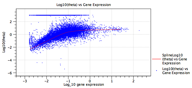
Figure 7.28: Fitted dispersion ![]() . The red line is the regularized trend, providing a more robust estimate of the dispersion. The expression of some genes is consistent with a Poisson distribution, seen here by the band of genes at
. The red line is the regularized trend, providing a more robust estimate of the dispersion. The expression of some genes is consistent with a Poisson distribution, seen here by the band of genes at
![]() .
.
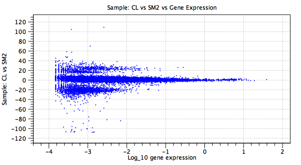
Figure 7.29: Batch effect term. The y-axis shows the natural logarithm of the fold change in the CL sample relative to the baseline SM2 sample. The large fold changes, concentrated in two bands at y=20 and y=-20, correspond to genes that are not expressed in at least one of the samples.