Viewing box plots
An example of a box plot of a two-group experiment with 12 samples is shown in figure 28.68.
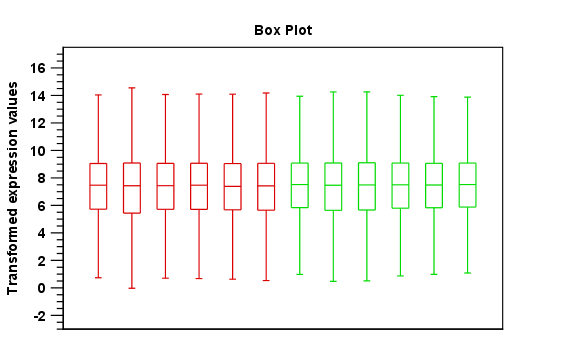
Figure 28.68: A box plot of 12 samples in a two-group experiment, colored by group.
Note that the boxes per default are colored according to their group relationship. At the bottom you find the names of the samples, and the y-axis shows the expression values (note that sample names are not shown in figure 28.68).
Per default the box includes the IQR values (from the lower to the upper quartile), the median is displayed as a line in the box, and the whiskers extend 1.5 times the height of the box.
In the Side Panel to the left, there is a number of options to adjust this view. Under Graph preferences, you can adjust the general properties of the box plot (see figure 28.69).
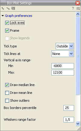
Figure 28.69: Graph preferences for a box plot.
- Lock axes. This will always show the axes even though the plot is zoomed to a detailed level.
- Frame. Shows a frame around the graph.
- Show legends. Shows the data legends.
- Tick type. Determine whether tick lines should be shown outside or inside the frame.
- Outside
- Inside
- Tick lines at. Choosing Major ticks will show a grid behind the graph.
- None
- Major ticks
- Vertical axis range. Sets the range of the vertical axis (y axis). Enter a value in Min and Max, and press Enter. This will update the view. If you wait a few seconds without pressing Enter, the view will also be updated.
- Draw median line. This is the default - the median is drawn as a line in the box.
- Draw mean line. Alternatively, you can also display the mean value as a line.
- Show outliers. The values outside the whiskers range are called outliers. Per default they are not shown. Note that the dot type that can be set below only takes effect when outliers are shown. When you select and deselect the Show outliers, the vertical axis range is automatically re-calculated to accommodate the new values.
Below the general preferences, you find the Lines and dots preferences, where you can adjust coloring and appearance (see figure 28.70).
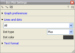
Figure 28.70: Lines and dot preferences for a box plot.
- Select sample or group. When you wish to adjust the properties below, first select an item in this drop-down menu. That will apply the changes below to this item. If your plot is based on an experiment, the drop-down menu includes both group names and sample names, as well as an entry for selecting "All". If your plot is based on single elements, only sample names will be visible. Note that there are sometimes "mixed states" when you select a group where two of the samples e.g. have different colors. Selecting a new color in this case will erase the differences.
- Dot type
- None
- Cross
- Plus
- Square
- Diamond
- Circle
- Triangle
- Reverse triangle
- Dot
- Dot color. Allows you to choose between many different colors. Click the color box to select a color.
Note that if you wish to use the same settings next time you open a box plot, you need to save the settings of the Side Panel.